| Still looks awful now the initial dust has settled 18:01 - Mar 6 with 3387 views | LankHenners |
|  |
| |  |
| Still looks awful now the initial dust has settled on 18:03 - Mar 6 with 3342 views | No9 |
Yes, YUK! |  | | |
| Still looks awful now the initial dust has settled on 18:06 - Mar 6 with 3315 views | Benters2 |
It looks crap. | | | |
| Still looks awful now the initial dust has settled on 18:11 - Mar 6 with 3272 views | itfcjoe |
Doesn’t look good does it |  |
| |
| Still looks awful now the initial dust has settled on 18:15 - Mar 6 with 3235 views | 12th_Man |
| Still looks awful now the initial dust has settled on 18:03 - Mar 6 by No9 |
Yes, YUK! |
Ipswich fans
"I hate Marcus Evans name plastered over everything"
*gets new sponsor*
"I hate this new sponsor, it's not the exact sponsor I wanted"
Face facts, we're not the friendly local club with a local sponsor anymore. It's sad but that's just modern football. | 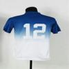 |
| |
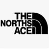
| Still looks awful now the initial dust has settled on 18:22 - Mar 6 with 3182 views | Mark |
I agree. It is horrible to promote an online casino, the opposite of what a community football club should be about. Yes, it may be the way football is going but we don't have to like it. I would never buy or wear one of those shirts. |  | | |
| Still looks awful now the initial dust has settled on 18:30 - Mar 6 with 3133 views | WestSussexBlue |
| Still looks awful now the initial dust has settled on 18:15 - Mar 6 by 12th_Man |
Ipswich fans
"I hate Marcus Evans name plastered over everything"
*gets new sponsor*
"I hate this new sponsor, it's not the exact sponsor I wanted"
Face facts, we're not the friendly local club with a local sponsor anymore. It's sad but that's just modern football. |
Sorry but it looks cheap tacky and advertising a gambling concern is plain hypocritical especially after we had to bale out Chopra for this very addiction whilst he was a Town player. | | | |
| Tinpot, right there. n/t (n/t) on 18:32 - Mar 6 with 3116 views | keighleyblue |
|  | | |
| Still looks awful now the initial dust has settled on 18:56 - Mar 6 with 3008 views | BlueBadger |
| Still looks awful now the initial dust has settled on 18:15 - Mar 6 by 12th_Man |
Ipswich fans
"I hate Marcus Evans name plastered over everything"
*gets new sponsor*
"I hate this new sponsor, it's not the exact sponsor I wanted"
Face facts, we're not the friendly local club with a local sponsor anymore. It's sad but that's just modern football. |
And yet, we've still managed to end up with one that's WORSE. |  |
| |
Login to get fewer ads
| Still looks awful now the initial dust has settled on 19:00 - Mar 6 with 2981 views | Ipswich_Crazy |
 |  |
| |
| Still looks awful now the initial dust has settled on 19:09 - Mar 6 with 2912 views | greyhound |
| Still looks awful now the initial dust has settled on 18:30 - Mar 6 by WestSussexBlue |
Sorry but it looks cheap tacky and advertising a gambling concern is plain hypocritical especially after we had to bale out Chopra for this very addiction whilst he was a Town player. |
Gambling is a massive part of sport now more so than ever before. Its always been present but now it slaps you in the face at every corner. To which end I don't care to much that our new sponsor is a gambling firm, or at least I've gotten over the fact we have sunk to that level of commercialism.
What I hate is the fact the logo looks like a bunch of over laid clip art and stock shapes with neon infill. It may me magical Vegas but they need some wizardry to improve brand identity.
Also on a blue shirt that logo will look horriffic | | | |
| Still looks awful now the initial dust has settled on 20:20 - Mar 6 with 2763 views | Taricco_Fan |
It wouldn't look so bad if the logo was designed to be more harmonious with the shirt, so to speak.
Drop the background and stars leaving just the 'Magical Vegas' text in white...that would look ok. Or just a monochrome version of the current logo with everything in white and a transparent background so the colour of the shirt forms the background of the logo.
Opinions on the nature of the sponsor aside, the logo is garish and tacky. There are too many colours going on for it to look good on a football shirt. |  | | |
| Still looks awful now the initial dust has settled on 20:28 - Mar 6 with 2677 views | jas0999 |
Disgraceful. | | | |
| Still looks awful now the initial dust has settled on 20:49 - Mar 6 with 2534 views | Lightningboy |
Think our owner may be in for a shock next season when no sod’s buying the shirts along with the season tickets. |  | | |
| Still looks awful now the initial dust has settled on 20:59 - Mar 6 with 2501 views | Coastalblue |
| Still looks awful now the initial dust has settled on 20:20 - Mar 6 by Taricco_Fan |
It wouldn't look so bad if the logo was designed to be more harmonious with the shirt, so to speak.
Drop the background and stars leaving just the 'Magical Vegas' text in white...that would look ok. Or just a monochrome version of the current logo with everything in white and a transparent background so the colour of the shirt forms the background of the logo.
Opinions on the nature of the sponsor aside, the logo is garish and tacky. There are too many colours going on for it to look good on a football shirt. |
Probably looked good on the outsourced designer's 19" monitor as he closed down paint. |  |
| |
| |
