| New Itfc Kit 20:24 - May 11 with 6032 views | Northstander_Blue |
..........................................................................................................................................................................................................Will have yellow on it [Post edited 11 May 2019 20:28]
|  |
| |  |
| New Itfc Kit on 12:17 - May 21 with 1098 views | footers |
| New Itfc Kit on 12:12 - May 21 by J2BLUE |
Sponsors generate money for the club. The shirt is not supposed to be a fashion item. |
Oh OK then, that's all settled. Thanks, J2. |  |
| |
| New Itfc Kit on 12:19 - May 21 with 1090 views | J2BLUE |
| New Itfc Kit on 12:07 - May 21 by footers |
We'll add 'graphic designer' to the list of jobs you're permanently barred from doing, the #1 place being a cook, naturally.
P.S. What is your current avatar? It's been giving me a headache! [Post edited 21 May 2019 12:07]
|
It's blue and white. I think I googled blue and white flag. It's the international shipping flag for a certain letter, I forget which one.
I don't like it and will change it when I think of something better. |  |
| |
| New Itfc Kit on 12:23 - May 21 with 1074 views | WarkTheWarkITFC |
| New Itfc Kit on 12:15 - May 21 by hoppy |
Not supposed to be, but does make a difference to whether some people may or may not buy it for looking awful. Our marketing people should be aware of that I would've thought. If it can look better and more people buy it, then it generates greater revenue than just coming from the sponsors for the privilege. |
Magical Vegas would have known that we wear blue and that their logo is on a blue background, with the top line of their name in blue. Three different colour blues.
From a distance you cannot see the sponsor logo. The point of paying large sums to sponsor the club is to increase their brand awareness. It helps to have a logo that can actually be seen by those that do not yet know what it is.
Hundreds of thousands of casual viewers of Sky Sports, Football League show, Goals Express etc. You want to be able to clearly read the name of the company.
Would have made sense if they adopted the logo to have Magical Vegas in white, so it completely stood out. The way it's just lumped onto the shirt looks lazy.
This is your domain Hoppy. What would you have done if you were Magical Vegas? |  |
| |
| New Itfc Kit on 12:23 - May 21 with 1074 views | footers |
| New Itfc Kit on 12:19 - May 21 by J2BLUE |
It's blue and white. I think I googled blue and white flag. It's the international shipping flag for a certain letter, I forget which one.
I don't like it and will change it when I think of something better. |
N.
N is for Nodge. Get your thinking cap on, lad! | |
| |
| New Itfc Kit on 12:23 - May 21 with 1071 views | ITFC_Forever |
| New Itfc Kit on 12:01 - May 21 by hoppy |
They've actually changed it themselves at Portman Road (which was of some annoyance to me, as it's something you just don't do to a logo, however hideous it is, in the way that they did it) - there were 2 or 3 instances along the advertising hoardings where it was stretched or condensed (and not to get any clever camera angles - just badly done!), but they did also have it displayed in a single line without the shape from memory, so it could be done.
(ITFC_Forever was sitting with us, so knows this was of some annoyance to me!)
I have several variations of my logo, depending on the application - that's one of things you consider when designing one, otherwise it can be rather a strait jacket if it's non-adaptable. [Post edited 21 May 2019 12:10]
|
Hoppy wasn't happy.
Another to add to the list of things of "what's wrong with ground" - in addition to foliage and green slime where these things shouldn't exist and also the state of the flags at the back of the middle tier of the Pioneer Stand at the North Stand end.... how hard can it be to take them down and put them in the washing machine? |  |
| |
| New Itfc Kit on 12:31 - May 21 with 1046 views | flimflam |
| New Itfc Kit on 12:12 - May 21 by J2BLUE |
Sponsors generate money for the club. The shirt is not supposed to be a fashion item. |
Maybe not but you always feel better in a shirt you actually like.
Thats why I have both the blue and white reto shirts from 81 as feel fantastic to wear them. |  |
| All men and women are created, by the, you know the, you know the thing. |
| |
| New Itfc Kit on 17:22 - May 21 with 975 views | FifeITFC |
Have you managed to read The Men Who Made The Town yet, 12thy?
You must think people on here are thicker than you are. |  |
| |
| New Itfc Kit on 17:28 - May 21 with 969 views | SpruceMoose |
| New Itfc Kit on 12:19 - May 21 by J2BLUE |
It's blue and white. I think I googled blue and white flag. It's the international shipping flag for a certain letter, I forget which one.
I don't like it and will change it when I think of something better. |
How about a quote from Twilight or something. It was good when you had that before. |  |
| Pronouns: He/Him/His.
"Imagine being a heterosexual white male in Britain at this moment. How bad is that. Everything you say is racist, everything you say is homophobic. The Woke community have really f****d this country." | | Poll: | Selectamod |
| |
Login to get fewer ads
| New Itfc Kit on 17:35 - May 21 with 953 views | BLUEBEAT |
| New Itfc Kit on 12:23 - May 21 by ITFC_Forever |
Hoppy wasn't happy.
Another to add to the list of things of "what's wrong with ground" - in addition to foliage and green slime where these things shouldn't exist and also the state of the flags at the back of the middle tier of the Pioneer Stand at the North Stand end.... how hard can it be to take them down and put them in the washing machine? |
One of those grotty banners had come unstuck at the top, so for the last month of the season the ITFC crest was hanging upside down.
Subversive message perhaps?
Distress signal, like the US flag, perhaps? |  |
| |
| New Itfc Kit on 17:42 - May 21 with 943 views | ArnieM |
| New Itfc Kit on 11:58 - May 21 by Swansea_Blue |
Well we do wear it so much better than those oiks up the road, so why not.
 |
THIS is exactly the away kit Town should be going back too! |  |
| |
| New Itfc Kit on 18:13 - May 21 with 919 views | ActionMan |
We change kits more times than glory hunting 10 year olds these days. Just ends up in the reduced bin at the end of the season as a result as very few buy them. Why bother? Is there really a huge demand for another set of frankly low standard Ipswich kits from Adidas?
I don't think so. They are usually bland templates or terrible. | 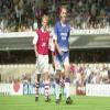 | | |
| New Itfc Kit on 18:31 - May 21 with 903 views | hoppy |
| New Itfc Kit on 17:42 - May 21 by ArnieM |
THIS is exactly the away kit Town should be going back too! |
Funnily enough, there seemed to be a few teams with a yellow and blue away kit this season - I looked on wistfully and admirably... Birmingham, Leeds were definitely two of them - I thought there were others, but I've gone blank if there was actually now, but they did make me think we should go back to it. The single colour betting logo 888 Sport in blue on the yellow where it is white on their blue home kit is exactly the approach Magical Vegas should do as well. |  |
| |
| New Itfc Kit on 22:41 - May 21 with 826 views | The_Last_Baron |
| New Itfc Kit on 11:58 - May 21 by Swansea_Blue |
Well we do wear it so much better than those oiks up the road, so why not.
|
Nice kit and a different shade of yellow. I could live with something like this. |  |
| |
| New Itfc Kit on 22:43 - May 21 with 825 views | The_Last_Baron |
| New Itfc Kit on 18:31 - May 21 by hoppy |
Funnily enough, there seemed to be a few teams with a yellow and blue away kit this season - I looked on wistfully and admirably... Birmingham, Leeds were definitely two of them - I thought there were others, but I've gone blank if there was actually now, but they did make me think we should go back to it. The single colour betting logo 888 Sport in blue on the yellow where it is white on their blue home kit is exactly the approach Magical Vegas should do as well. |
Agreed. The first two kits from Adidas in the modern era were great, the last three not so good. | |
| |
| New Itfc Kit on 09:10 - May 23 with 705 views | J2BLUE |
| New Itfc Kit on 11:58 - May 21 by J2BLUE |
You said 'not sure Magical Vegas would be willing to let us improve their hideous logo though'
Of course they wouldn't. Apparently it wasn't that obvious to you if you weren't sure... 
Changing the colours isn't the same as completely ignoring their logo for words. |
Well I hold my hands up, got this one totally wrong.
I didn't mind the old logo but the white looks brilliant. | |
| |
| |