| Have we covered Peterborough's rebrand yet? 22:10 - May 31 with 2520 views | Zx1988 |
Tell me you had no understanding of the composite parts of the original crest, without telling me you knew sweet FA about the meanings behind the original crest.
Saint Peter's dropped one of his keys, for starters. |  |
| |  |
| Have we covered Peterborough's rebrand yet? on 22:33 - May 31 with 2332 views | Pique |
Looks like an online bank. |  | | |
| Have we covered Peterborough's rebrand yet? on 22:42 - May 31 with 2280 views | Nutkins_Return |
It is actually two keys in the logo if that is what you mean? | |
| |
| Have we covered Peterborough's rebrand yet? on 23:34 - May 31 with 2103 views | Churchman |
Well the lion thing looks like he’s thinking ‘if that’s the size of the fling key, how big is the door???’
And i presume it’s a door on a boat as POSH stands for Port Out Starboard Home
Actually, according to the internet ‘The keys represent Saint Peter, as the city is named after Saint Peter's Cathedral. They are often referred to as the "keys to heaven"
I’ve been to Peterborough. Heaven it’s not. [Post edited 31 May 23:37]
|  | | |
| Have we covered Peterborough's rebrand yet? on 07:42 - Jun 1 with 1689 views | NthQldITFC |
| Have we covered Peterborough's rebrand yet? on 22:33 - May 31 by Pique |
Looks like an online bank. |
Is that rhyming slang? |  |
| |
| Have we covered Peterborough's rebrand yet? on 07:54 - Jun 1 with 1621 views | NthQldITFC |
Is it Victoria Beckham modelling shoulder pads, waiting for a bus, carrying a first aid kit? | |
| |
| Have we covered Peterborough's rebrand yet? on 08:05 - Jun 1 with 1582 views | You_Bloo_Right |
| Have we covered Peterborough's rebrand yet? on 23:34 - May 31 by Churchman |
Well the lion thing looks like he’s thinking ‘if that’s the size of the fling key, how big is the door???’
And i presume it’s a door on a boat as POSH stands for Port Out Starboard Home
Actually, according to the internet ‘The keys represent Saint Peter, as the city is named after Saint Peter's Cathedral. They are often referred to as the "keys to heaven"
I’ve been to Peterborough. Heaven it’s not. [Post edited 31 May 23:37]
|
According to my edition of Brewer's Dictionary of Phrase and Fable (with a foreword by Terry Pratchett) that traditonal explanation of POSH "is almost certainly fictitious", the dictionary assuming it was just a slang word for a "dandy".
The club's nickname, of course, was due to Fletton Utd manager Pat Tirrell's desire to find "posh (i.e. good) new players for a posh new team."
As for your assertion with regards to the town itself, I can only concur. | 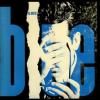 |
| |
| Have we covered Peterborough's rebrand yet? on 08:13 - Jun 1 with 1535 views | WeWereZombies |
| Have we covered Peterborough's rebrand yet? on 08:05 - Jun 1 by You_Bloo_Right |
According to my edition of Brewer's Dictionary of Phrase and Fable (with a foreword by Terry Pratchett) that traditonal explanation of POSH "is almost certainly fictitious", the dictionary assuming it was just a slang word for a "dandy".
The club's nickname, of course, was due to Fletton Utd manager Pat Tirrell's desire to find "posh (i.e. good) new players for a posh new team."
As for your assertion with regards to the town itself, I can only concur. |
I worked in Peterborough for over a year and I think you will find that it is a city, it has a cathedral and everything. I mean what type of conurbation with a cathedral and a league football team could rank so very, very far below a town ? |  |
| |
| Have we covered Peterborough's rebrand yet? on 08:21 - Jun 1 with 1496 views | Zx1988 |
| Have we covered Peterborough's rebrand yet? on 22:42 - May 31 by Nutkins_Return |
It is actually two keys in the logo if that is what you mean? |
If that's the case, it's very poorly executed.
It looks more like a silhouette/shadow, and St Peter's Keys are traditionally crossed, rather than stacked.
A pretty damning indictment of their 'engagement exercise':
 | |
| |
Login to get fewer ads
| Have we covered Peterborough's rebrand yet? on 08:59 - Jun 1 with 1321 views | DanTheMan |
That's proper rubbish. |  |
| |
| Have we covered Peterborough's rebrand yet? on 09:07 - Jun 1 with 1274 views | Metal_Hacker |
I'd be Lion if I said they'd done a good job |  |
| |
| Have we covered Peterborough's rebrand yet? on 09:24 - Jun 1 with 1207 views | hoppy |
| Have we covered Peterborough's rebrand yet? on 08:21 - Jun 1 by Zx1988 |
If that's the case, it's very poorly executed.
It looks more like a silhouette/shadow, and St Peter's Keys are traditionally crossed, rather than stacked.
A pretty damning indictment of their 'engagement exercise':
|
There’s a negative space cross IN the keys, if that helps…
Personally, think it looks awful, but I’ve not seen the rest of the brief. |  |
| |
| Have we covered Peterborough's rebrand yet? on 09:31 - Jun 1 with 1167 views | WeWereZombies |
| Have we covered Peterborough's rebrand yet? on 09:24 - Jun 1 by hoppy |
There’s a negative space cross IN the keys, if that helps…
Personally, think it looks awful, but I’ve not seen the rest of the brief. |
Maybe it was the brief that was pants ? | |
| |
| Have we covered Peterborough's rebrand yet? on 10:09 - Jun 1 with 1022 views | BlueandTruesince82 |
This looks like it was done on MS paint |  |
| |
| Have we covered Peterborough's rebrand yet? on 10:56 - Jun 1 with 902 views | SWLondonBlue93 |
It's giving me Pro Evo Chelsea vibes. | | | |
| Have we covered Peterborough's rebrand yet? on 11:35 - Jun 1 with 814 views | Blue_Moses |
| Have we covered Peterborough's rebrand yet? on 10:56 - Jun 1 by SWLondonBlue93 |
It's giving me Pro Evo Chelsea vibes. |
West London Blues? | | | |
| Have we covered Peterborough's rebrand yet? on 15:40 - Jun 1 with 579 views | backwaywhen |
Estate agents board ….. lol | | | |
| |