By continuing to use the site, you agree to our use of cookies and to abide by our Terms and Conditions. We in turn value your personal details in accordance with our Privacy Policy.
Please log in or register. Registered visitors get fewer ads.
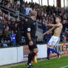
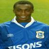
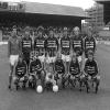
Town have revealed their kits for the 2018/19 season, which see a return to white sleeves for the home strip, as well as red detailing, and orange for the away.
“Reverting to a retro-inspired round neck, Town’s new home shirt features white sleeves with blue and red contrast detailing,” the club explain on the official site.
"The red detailing continues across the adidas three-stripe branding to the shirt shoulders, shorts side panels and sock turnovers.
“The away kit is one of the most striking kits yet from adidas. The solar orange shirt, shorts and socks, feature contrast black detailing. It’s sure to be easy to spot from a distance, being the brightest away kit Town have worn in recent times.
“Continuing the orange theme, Town’s goalkeepers will also wear an orange kit when turning out at Portman Road.”
The away kit will be available via Planet Blue and online from Friday 8th June with hte new home strip due at Portman Road at the end of June, with a launch date of Friday 29th June having been pencilled in. The home kit can be pre-ordered online from Tuesday, 6th June.
The two goalkeeper kits will be launched in July on a date yet to be confirmed.
The shirts will be priced at £45 for adults and £35 youth sizes, which won’t include the Magical Vegas logo due to EFL rules on gambling sponsors.
The kits will be on display on the Town stand at the Suffolk Show on Wednesday and Thursday.
Photos: ITFC
Please report offensive, libellous or inappropriate posts by using the links provided.
Well I like all the kits. They'll look very good in the SKY BET CHAMPIONSHIP. I wonder how many of you on your moral high horses boycotted the shirts when they had an alcohol manufacturer on the shirt for six years. How many of you stood/sat in a stand named after a cigarette company?
The entire football league is sponsored by sky bet and the majority are also sponsored by bet365, personally don't see the problem, more money for the club is always a bonus
The first choice kit is garish, but having seen the hideous orange kit, I hope we wear blue & white whenever possible (which we should in any case). However, the orange won't clash with too many other sides so I think we'll be seeing a lot of it. All will be forgiven if we have a good season.
Magenta stripes and blue...I'm a graphic designer (or use to be) and that's a big no no, orange strip is the better of the two - worst bit of it though has to be that Magical Vegas.
Can't believe all the fuss over a couple of words on a shirt which will make the Club a considerable amount of money. Its common for betting companies to sponsor different organisations so why not Ipswich Town. Shall we all boycott Sky and not play in the Skybet League because of its sponsors. As others have mentioned this site should be called 'Moan Are The Days' which it is what it has become. To youngsters Magical Vegas may not even reflect a betting company as the word betting is not shown. Those old enough to bet will still bet whether the ad is on a football shirt or not. Its bringing in money to the Club for heaven sake.
@ StowTractorBoy, morals aside the MV logo looks rubbish. Even if it wasn't a gambling company I still wouldn't want to fork out £45 with that on the front as it totally ruins the look! And the deal they gave us wasn't that great from what I can gather. Looks at customer reviews on the company too, their reviews on the whole are pretty rubbish. Sound like a cowboy outfit from the reviews I read. Do we really want to be associated with a company like that? And besides the logo looks rubbish so it totally ruins the shirt for me. I'd happily buy the orange away shirt without the sponsor but not with it on. There's nothing magical about that sponsor or logo whatsoever! You could get a more professional and aesthetically pleasing logo knocked up on Fiverr.com for £5 in 24 hours, seriously. It's just not a looker!
DurhamTownFan it's about opinions and sharing our views? Seriously supporters moan all the time it wouldn't matter who's on the shirt? Anyway we must meet up sometime you still in Durham? As don't live that far from there?
I'm not morally against betting companies, but I did prefer a proper sponsor like Pioneer, Greene King, and even Fisons. Magical Vegas is such a tacky crappy name though.