By continuing to use the site, you agree to our use of cookies and to abide by our Terms and Conditions. We in turn value your personal details in accordance with our Privacy Policy.
Please log in or register. Registered visitors get fewer ads.
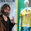
Town have revealed their kits for the 2018/19 season, which see a return to white sleeves for the home strip, as well as red detailing, and orange for the away.
“Reverting to a retro-inspired round neck, Town’s new home shirt features white sleeves with blue and red contrast detailing,” the club explain on the official site.
"The red detailing continues across the adidas three-stripe branding to the shirt shoulders, shorts side panels and sock turnovers.
“The away kit is one of the most striking kits yet from adidas. The solar orange shirt, shorts and socks, feature contrast black detailing. It’s sure to be easy to spot from a distance, being the brightest away kit Town have worn in recent times.
“Continuing the orange theme, Town’s goalkeepers will also wear an orange kit when turning out at Portman Road.”
The away kit will be available via Planet Blue and online from Friday 8th June with hte new home strip due at Portman Road at the end of June, with a launch date of Friday 29th June having been pencilled in. The home kit can be pre-ordered online from Tuesday, 6th June.
The two goalkeeper kits will be launched in July on a date yet to be confirmed.
The shirts will be priced at £45 for adults and £35 youth sizes, which won’t include the Magical Vegas logo due to EFL rules on gambling sponsors.
The kits will be on display on the Town stand at the Suffolk Show on Wednesday and Thursday.
Photos: ITFC
Please report offensive, libellous or inappropriate posts by using the links provided.
Personally I prefer last season's kit, which I will wear instead.
The new blue one looks like one of the latter Mitre shirts and the orange one reminds me of the wonderful orange Umbro effort...Chris Kiwomya...you know when you have been Tangoed!
The new sponsorship is sadly a reflection of where sport and football in general is today. The world is truly not a better place for the £100m+ footballers. Plain greedy.
Love how PC we all are nowadays, people taking the moral high ground over a betting company and how betting ruins lives! Did we all complain when Greene King sponsored us? Because alcohol ruins lives too! Anyway, we're all entitled to an opinion, I won't become a gambling addict because we're sponsored by an online betting company, however I do understand some people's concerns, I'm sure there's some of you out there who know someone who has hit huge debts because of gambling and the repercussions it brings. As to the actual kit, I like it, however I can't stand the sponsors logo, it looks awful! Not because they're an online casino, just because it's flipping awful.
I like both kits and the goalkeeping kits excellent. People are getting too hung up about the sponsor logo, and in doing so are just adding to the advertising. We play in the Sky Bet Championship and the only way we can get out of this betting scenario is to get promotion. Time for all real Ipswich Town supporters to start backing the club, support the team, give the new manager total support. I am a season ticket holder, I might buy a new shirt, I don't bet, I do drink, but when we had Greene King as our sponsors, I couldn't care less, I only watched, and supported the team.
where has all this red come from? last season we were Barnsley this year we look like top shop have designed the home kit. and that logo will mean ITFC won't sell many. why don't ITFC put fans first for a change as an overseas betting co they don't have to pay VAT , just another tax dodge from ME/IM
If you read the article fully, you will see it says the replica shirts will NOT have the sponsors logo on it.so you won't have to walk around advertising
Why anyone over the age of 13 would want to walk round in any replica top of any design is totally beyond me. Overpriced cheap polyester tat. 45 quid to look like a total bell end. No thanks.
Kits actually look quite decent, baring the sponsor.
Home - Would have preferred less red on the home (white stripes on the shirt, blue stripes on the shorts, white on the socks) would have looked far better.
Away - One of the nicest we have had in a while, really like the shirt detail.
Like the new jersey , but sponsor logo ruins it , I didnt like the ME logo but this is 10 times worse , although same can be said for majority of sponsor logos on kits.
This is why I'm glad we change kits every season! It means we only have 12 months to put up with offerings we don't like. I'm a huge fan of Adidas and love the heritage connection to the club. (I'm longing for an updated version of the 81-83 shirt!) Personally, I'm not a fan of round necks so not a good start for me. I don't mind the white sleeves as they are traditional but growing up in the 70's/80's the all blue shirt is more traditional for me and is always my preference. The home kit has too much red in it. The away isn't bad and the pattern is on trend with a number of the World Cup kits this year. However, the biggest issue is the sponsor, a) I don't agree with it ethically and b) It looks absolutely terrible! Stick that sponsor on any great or classic shirt from Adidas and it will immediately become a c*** shirt. Sadly I won't be buyng the shirt for the next three years because of this. Unless we get promoted and I can see Magical Vegas being binned for another sponsor willing to buy out the contract (as has happened with Wolves this season). I really hope the club listen to all the feedback regarding the sponsor but I'm not sure it will.
Personally i like both kits, prefer the orange to the blue. I do have agree with the masses and say the logo is hideous. A good point of protest or voicing of opinion would be the suffolk show if anyone is going over the next two days. Visit the ipswich stall and let them know direct. Fans voicing their opinion works. It got MM out.
"Striking" is one way of describing that orange monstrosity, I suppose. For our away kit, what's wrong with white shirts featuring a black pinstripe and "Pioneer" emblazoned across the front ?