Town Launch New Home Kit
Tuesday, 30th Jun 2020 14:26 Town have revealed their new home kit for the 2020/21 season which, as TWTD previously reported, is a tribute to the strip the Blues wore 40 years ago in 1980/81, the campaign widely regarded as the club’s greatest in which they won the UEFA Cup.
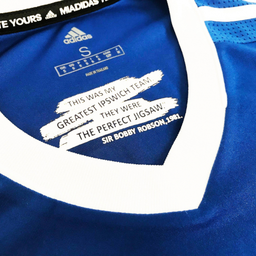
The shirts, produced by adidas as was the case in 1980/81, feature a one-year return of the badge worn in that era - which was replaced in 1995 - with the legend ‘UEFA Cup 40 years’ below it.
The inner back-neck of all home shirts feature Sir Bobby Robson's quote about that side, “This was my greatest Ipswich team, They were the perfect jigsaw.”
The traditional blue shirt is augmented by what the club is describing as a “seasonal change” to blue shorts, which were worn in the away leg of the final against AZ 67 Alkmaar in Amsterdam in which Town confirmed a 5-4 on-aggregate victory, as well as in the memorable away victories at St Etienne and Cologne in the semi-finals.

The socks are blue with a white trim, however, with the adidas three stripes blue rather than white as in recent seasons and in 1980/81.
The front of the shirt bears the Carers Trust logo, something gifted to the charity by sponsors Magical Vegas.
Carers Trust CEO, Gareth Howells told the club site: “We are thrilled to see unpaid carers recognised with the Carers Trust logo featured on such a special commemorative shirt. On behalf of all the unpaid carers we work with, I’d like to wish Ipswich Town every success for the new season.”
John O’Reilly, chief executive of Rank who own Magical Vegas, added: “We’re proud of our partnership with Carers Trust and we’re continually looking at ways in which we can further support the charity.

“We’re delighted that this sponsorship will shine a much needed spotlight on the fantastic work Carers Trust do in supporting unpaid carers across the UK.”

The new shirt will also feature the updated EFL name and number font as well as the logo of the EFL’s charity partner, Mind.
Fans can also have ‘Thank you NHS” added to the back of their shirts with all profits going to the Colchester and Ipswich Hospitals Charity.

The back of the shorts bear the Mortgagemove.co.uk brand. Company principle Nick Golding said: “We are delighted that the Mortgagemove.co.uk logo adorns the new kit which is a tribute to such a successful period in ITFC’s history.”
The kit can be preordered now from www.itfcshop.com with delivery as soon as they arrive at the club, late July at the latest, although the club say that is still to be confirmed due to the ongoing uncertainties caused by the Coronavirus pandemic.
Fans who preorder will also receive a set of six luxury postcards (worth £15) designed by illustrator George Ripton. Each postcard will depict a scene from the 80/81 UEFA Cup campaign.
Given the guidelines around social distancing and the advice given to retail stores, the pre-ordering is only available online.
Photos: ITFC
Please report offensive, libellous or inappropriate posts by using the links provided.
runningout added 23:38 - Jun 30
Everything is embarrassing at ITFC.. it's difficult not to be ashamed of our club. When we stopped playing we were in relegation form. I'm really trying to find something good to cling to. Good shirts though |  | |
ONENIL78 added 00:14 - Jul 1
Nice..but £48 a pop..really??
| | |
TimmyH added 00:17 - Jul 1
Quite like the shirts...shame about the rubbish that will be wearing them on the pitch. The manager, staff and players really owe the supporters. |  | |
jong75 added 05:14 - Jul 1
Personally, i find this quite embarrassing and distasteful. To focus so much on one of the greatest era's of our clubs history with our team languishing in the 3rd tier? Using the old club badge? In my opinion we should have used the current crest with a mention of the 40 year anniversary above the badge, or better still on the back neck yoke. | | |
budgieplucker added 07:24 - Jul 1
I was in Amsterdam on that warm night in 1981 and remember vividly the match that evening and the see saw of emotions from starting to increase our comfortable First leg lead to being pegged back and seeing the deficit for AZ being reduced and nail biting run down of the clock. That match among a few others live in memory and being old enough to remember the great times.
However, I don't see any mileage or need to bring back a retro shirt and dispense with the three stars. This is too gimmicky for me.
But then call me an old fogey I have been pretty underwhelmed with most of the home kits for quite sometime apart from the kit worn this season which I thought was the nicest for a long time (only tarnished by the magical Vegas logo).
Whilst all blue can look smart on an individual, royal blue as a colour isn't a strong standout colour and therefore I always feel a good element of white mixed in the kit gives a good tonal value which can be picked out much easier on the eye to recognise emerging patterns of play and options available to players on the pitch when in possession.
What disappoints me is at a glance we could be any of a large number of teams playing in blue. Clubs like Arsenal, Ajax, to name a couple have a distinct identity in their home shirts and only introduce subtle differences Each year. Play around with the away kit all you want but remain consistent with the branding of your home shirt.
Now whilst I hate those budgie shirts you can clearly pick a budgie out at 100 Yards.
From my perspective I would have developed and kept the shirt branding consistent with our greatest ever achievement under Sir Alf winning the top tier at the first attempt.
Repeating myself again but enormously disappointed at dropping the 3 stars.
|  | |
heathen66 added 09:00 - Jul 1
I would loved to have seen the retro Adidas Logo (as per 80/81) and the three stripes go all the way down the sleeve |  | |
rugbytomc added 09:01 - Jul 1
I like it, looks great. Have pre ordered for my boys. Might even splash out myself at Christmas!
Like everyone, let's hope we have a season worthy of the shirt. COYB | | |
dirtydingusmagee added 09:25 - Jul 1
JONG75, My point exactly ,its a bit like rubbing salt in the wound, celebrating the best time with the new kit when we are at our lowest point, would have been more appropriate if the kit was black. with RIP on it . |  | |
Bert added 09:31 - Jul 1
I can never get too fussed about a new kit but this one looks particularly good. The blue shorts are a hit with me as it looks the real deal. The club can't win what ever they do. Do our non attending moaning 'supporters' really think that because we are 'languishing in league one' we should play in sack cloth ? Moaning never achieves anything, criticising your club in a proper manner will make the powers that be listen. | | |
Taricco_Fan added 09:37 - Jul 1
It's a lovely kit and I much prefer the old badge. The shirt is a 'must buy' for my son and I.
The only downside is the blue shorts. I appreciate the historical significance of them and it's fine for a season, but Town's shorts should always be white. |  | |
Bergholt_Blue added 09:51 - Jul 1
YELLOW!!!!! On th badge wtf
No I won't be getting this |  | |
Razor added 10:09 - Jul 1
I think the shirt is great and will certainly be stumping up for it.
Somebody did mention the white socks from years ago and together with white shorts would make us look quite distinctive and different.
Anyway lets stay positive and hope we can celebrate this anniversary with a promotion. | | |
DifferentGravy added 11:04 - Jul 1
Glad the badge is back, the yellow is much better than the red. Agree, we should have white shorts rather than white. | | |
DifferentGravy added 11:05 - Jul 1
Try that again........white shorts rather than blue | | |
carlo88 added 11:13 - Jul 1
...You're not fit to wear the shirt....etc etc
Like it though might even buy one. | | |
Dozzells_Bobblehat added 11:35 - Jul 1
Bergholt the badge was originally yellow and in my opinion looks better that way . Yellow and blue away kit too. |  | |
Westy added 12:24 - Jul 1
The badge was originally yellow but also the wording is slightly different from the red. | | |
StavangerBlue added 14:04 - Jul 1
Funny how times and taste change things. The original badge was the Ipswich coat of arms. Then after a fan competition in 1972, won by John Gammage, the yellow badge was selected. The design was hand drawn and amateur in execution - not well balanced but distinctive and loved by fans. Design wise this was modernised in 1995 when Sheepshanks rebranded the club. The yellow was switched to red (I don't like the red it is not Ipswich for me) but many said it was to make us away from that yellow Norwich colour. The horse was beefed up, wording changed to make it more balanced and the ramparts moved to the top.
I think the new badge would be great in white, blue and yellow - ditch the red but that is my POV.
All home shirts should be plain blue, shorts white and socks blue. The away kit is for the fashion police - although we always look best and play better in all orange or black and white.
Now the shirt is decided, let's focus on the team and getting back into the Championship. |  | |
runningout added 15:04 - Jul 1
Should do upmost to have minimal yellow or green on our kit ;-) | | |
pbishop1799 added 12:12 - Jul 4
Magical Vegas expunged -- this is GREAT news.
Them and others are societal cancer. Such a shame, the number of Prem and Ch/ship clubs sponsored by similar firms.
|  | |
You need to login in order to post your comments
|