Town Reveal New Kits
Thursday, 16th Jun 2022 09:37 Town have unveiled their Umbro home and away kits for the 2022/23 season.
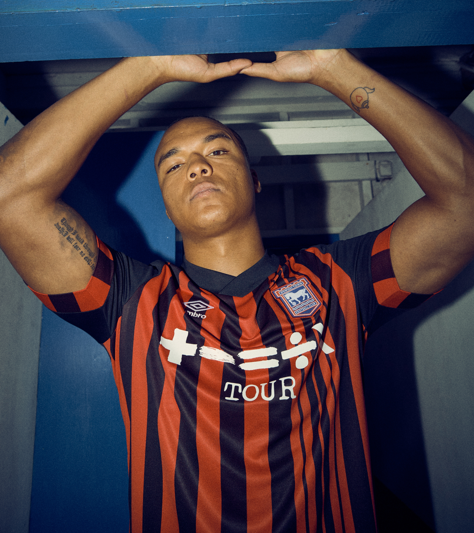
The home strip, modelled above by local boxer and Blues fan Fabio Wardley, echoes the 1991/92 Second Division title-winning kit - the last in which Town won a league title - with the larger red around the neck and white ends to the sleeves perhaps a nod to the shirt from the following two Premier League seasons.
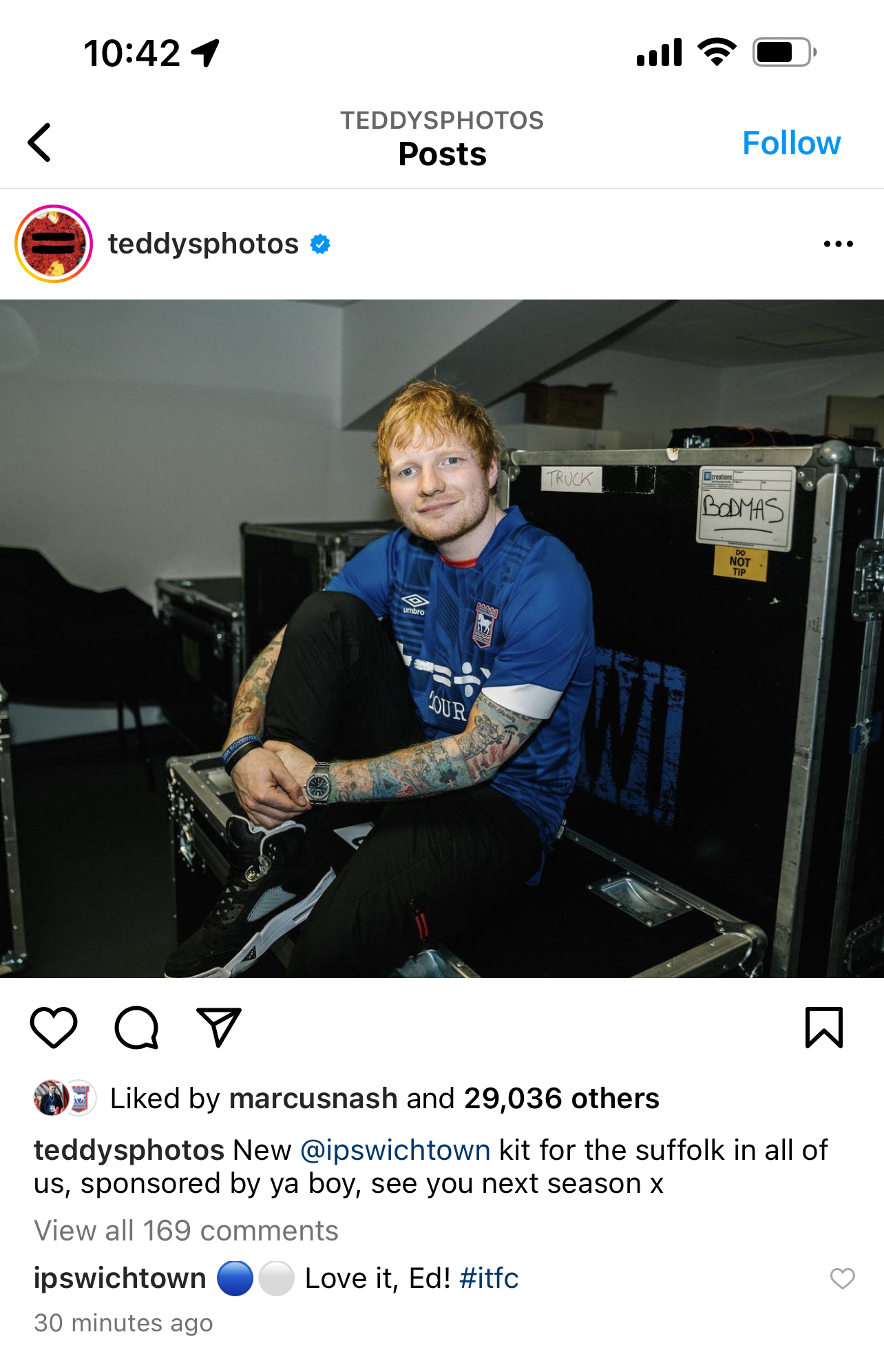
The shirt bears sponsor Ed Sheeran's tour logo, as does the change strip, while the three stars in tribute to the 1961/62 First Division title, 1978 FA Cup win and 1981 UEFA Cup triumph move to the back below the collar.
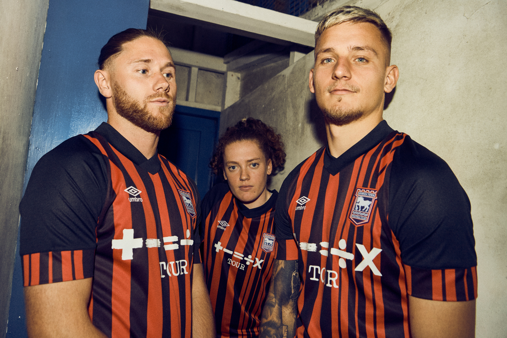
The away kit harks back to the popular yet not made available at the time third strip from the early nineties. The Blues initially wore a red and black striped AC Milan shirt as their third strip in the early 1980s.
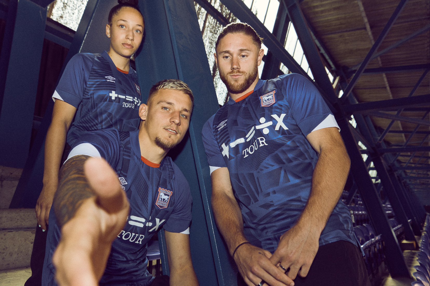
Revealing the strips, the club site said: “The blue home jersey features a distorted linear graphic, inspired by the architectural lines and structure of the Cobbold Stand at Portman Road.
“Knitted white pique shorts and blue socks with white part hoop complete the kit that the Blues will don for the new campaign.
“The away jersey pays homage to two iconic Town strips — the 1992/93 third kit and the 1993/94 away kit. Both were supplied by Umbro and worn by Town in the Premier League. The red and black shirt features a graphic front, back body stripe and raglan sleeves.
“Town Women, who currently compete in the FAWNL Southern Premier Division, will also be wearing Umbro’s new design as they vie for promotion in 2022/23.
“Using extensive experience, advanced technology, and a pioneering approach, Umbro has created a kit that gives Town players the chance to perform at their best on the pitch, while also ensuring fans can enjoy wearing a replica as they support the Blues from the stands.”
Town’s head of retail operations Paul Macro said: “It has been great working in partnership with Umbro to deliver two fully bespoke and unique kits.
“Every design or detail that features in the home or away kit has a story behind it. We’re so pleased to finally show them to supporters.
“As well as the home and away product that is currently on pre-order, we’ll also be offering home mini kits from three-six months upwards, away mini kits from two-three years upwards and we will be trialling ladies fit shirts in both the home and away designs. These should all be available on the general sale dates.”
Jonathan McCourt, head of sports marketing at UK Football Umbro, added: “We’re proud to share Ipswich Town’s home and away kits for the new season.
“This season’s home kit has a modern feel while still capturing the essence of Ipswich Town Football Club. The away jersey has the hallmarks of the club’s famous kits from both 1992/93 and 1993/94.
“It’s been great to rejoin forces with a club that we share so much history with. We cannot wait to see players and fans alike donning the famous double-diamond once again.”
The new kits, the first produced by new supplier Umbro, are available for pre-order online here.
ITFC/Umbro
Please report offensive, libellous or inappropriate posts by using the links provided.
Orraman added 10:43 - Jun 16
Amazing how many fashionistas read this report. Personally, as long as the home shirt is predominantly the correct shade of blue,I couldn't care less what it looks like as long as we win enough games to get out of this league |  | |
SamWhiteUK added 10:44 - Jun 16
Think the sponsor looks a little too high up, and in some of the shots it looked ill-fitting. I'll reserve further judgement |  | |
December1963 added 10:45 - Jun 16
Will look fantastic if we are parading the Division 1 trophy around PR come May. Was a bit concerned when I read the shorts were knitted thought my dear old man had got the needles out again!!! | | |
Cakeman added 10:52 - Jun 16
It's amazing to read so many different comments on how people see these new kits.
It really is just about peoples personal choice.
For me I like the deeper colour Blue on the home kit and the away kit looks nice although I would rather we went back to the Yellow and Blue days. As said all personal choice. |  | |
algarvefan added 11:08 - Jun 16
I like the home but not so keen on the away, to be honest they could play in a Laura Ashley dress for all I care as long as the football is good, that's all that matters to me. |  | |
Rimsy added 11:19 - Jun 16
Really like the away shirt. Home shirt nice apart from the geometric patterns, been better just solid colour. All in all nice to get something a bit different to the run of mill. |  | |
Europablue added 11:21 - Jun 16
I already bought the kit last year, so I don't think I'll get another one. I do like the home shirt, but not the away.
The main complaint I had about the last Adidas was that they didn't have toddler sizes. I really wanted to buy my boy his first kit, so I should be able to get this one for him this time. | | |
Rimsy added 11:21 - Jun 16
Oh, and now that's out of the way, they better get some signings in quick so we have something to talk about. | | |
PackwoodBlue added 11:24 - Jun 16
The fact the website is struggling and currently has a 40 minute waiting time, speaks volumes. #COYB. | | |
ThaiBlue added 12:25 - Jun 16
Both nice shirts well done umbro. | | |
OwainG1992 added 12:36 - Jun 16
Shocked by the negativity of some.
Think they are fantastic.
Best kits we've had in yonks. | 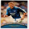 | |
AbujaBlue added 12:40 - Jun 16
Really like them both. A step away from the nice looking but bland Adidas kits. These actually have an ITFC identity and connect to our history. |  | |
arc added 13:01 - Jun 16
The colours and shape are OK. I just find these shirts with the designs woven through them to be too complicated. Can't we have blue shirts? I like the away strip, though.
And, as others have said, these shirts will look great if we win :-)
(Oh, and the video is nicely produced–that makes a change!) |  | |
JohnnyCougar added 13:08 - Jun 16
I was a little worried when I saw the kits of the other Umbro-teams and I can say that my fears came true. :) (Both Derby's and Bournmouth's are just awful).
Think what you want about Adidas, but the class is a few notches higher and above all a much cleaner look. Sometimes it's good to take a step back and not overdesign.
The main thing, however, is that the majority of the fans are happy and that seems to be the case. All good. |  | |
Taricco_Fan added 13:30 - Jun 16
I'm a fan of both. I like the 90s vibe and bespoke nod to the 91/92 season on the home shirt. The away shirt is my favourite away colour combo and reminds me of the 92/93 away shirt which was a classic in my opinion. |  | |
blues1 added 13:33 - Jun 16
Johnny cougar. We have a kit now, thst no other club will be wearing. Under Adidas, all we hot the last few years, werdcthd kits Chelsea had worn the previous season. No imagination whatsoever. Also the club had a big say in the design of these 2 kits. Both of which have club history in them. | | |
Linkboy13 added 13:57 - Jun 16
Oh no not another home blue shirt. Just joking must admit quite shocked when i first saw it looks a more casual type shirt with the small collar from the nineties era. The blue looks quite dark in the picture but all in all i like it. One small negative it looks like it might be a bit warm if the weather is hot but might be my imagination. Really luv the away shirt been crying out for the red and black stripes to return for a long time and i shall definitely be buying it. So all in all it's a yes vote from me. | | |
Linkboy13 added 14:02 - Jun 16
Forgot to add that you don't really get the complete idea of what a kit looks like until you see it in its full entirety (shirt shorts and socks) . | | |
cazwells1 added 14:16 - Jun 16
Love them both! I could not give my money away on the website though! Took over 4 hours to buy them! | | |
Thegeniusofmuhren added 14:22 - Jun 16
That is an awful design. If the price is as cheap as the shirt looks, they'll sell a few though. The away kit is better than the home kit. Not and never have been a fan of the 3 stars either.
|  | |
WesBurnsHeadband added 14:32 - Jun 16
Love both. So nice to have something unique. Can't work out which one will look best when Morsy lifts the L1 trophy |  | |
budgieplucker added 14:38 - Jun 16
In fairness to Umbro having looked at their website in recent days and also some of the kits they have supplied other teams, they have some cracking kits and are very much providing a real challenge to the heavyweight manufacturers like Addidas and Nike. So I personally welcome the change. My only disappointment is mainly driven because nobody is modelling the full kit in its glory and several the shots have been taken in shaded areas potentially giving the kit the impression of being darker than it probably actually is. I am not sure I quite resonate with the abstraction of the Cobbald Stand but can make believe that it is the tyre marks of this coming seasons tractor which going to see all the opposition ploughed up good and proper. But otherwise the home kit is a thumbs up from me and sense I will like it better when I see the full kit in full sunlight.
With regards to the away kit, again a smart offering. Personally though I have always disliked Town playing in red which for me is the complete antithesis of blue and used by so many teams. Always Orange and white alternated every season for me!!! So 1 out of 2 for me. |  | |
You need to login in order to post your comments
|