The ITFC Crest: time for an update?
Written by oshilling_coyb on Friday, 3rd Dec 2021 17:00
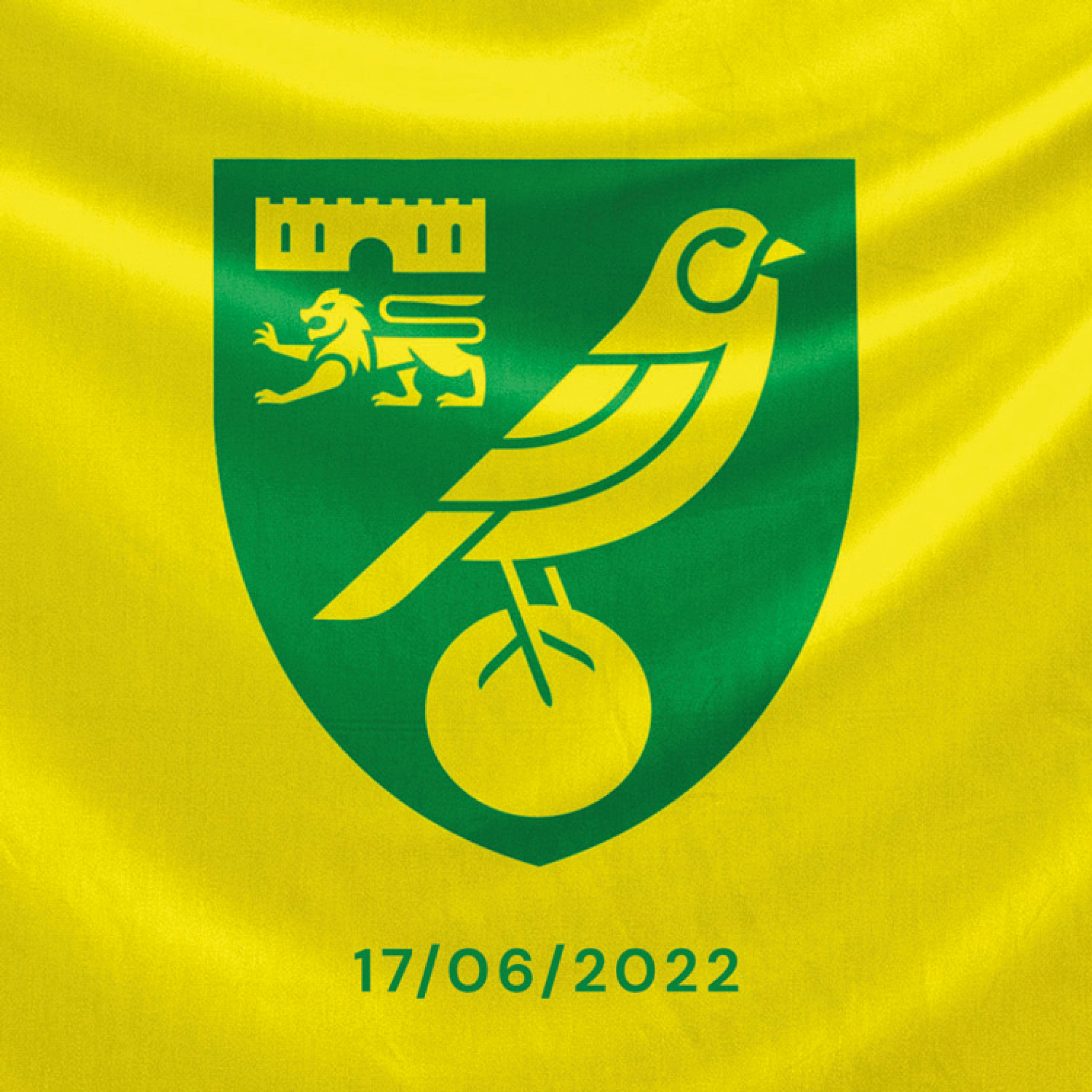
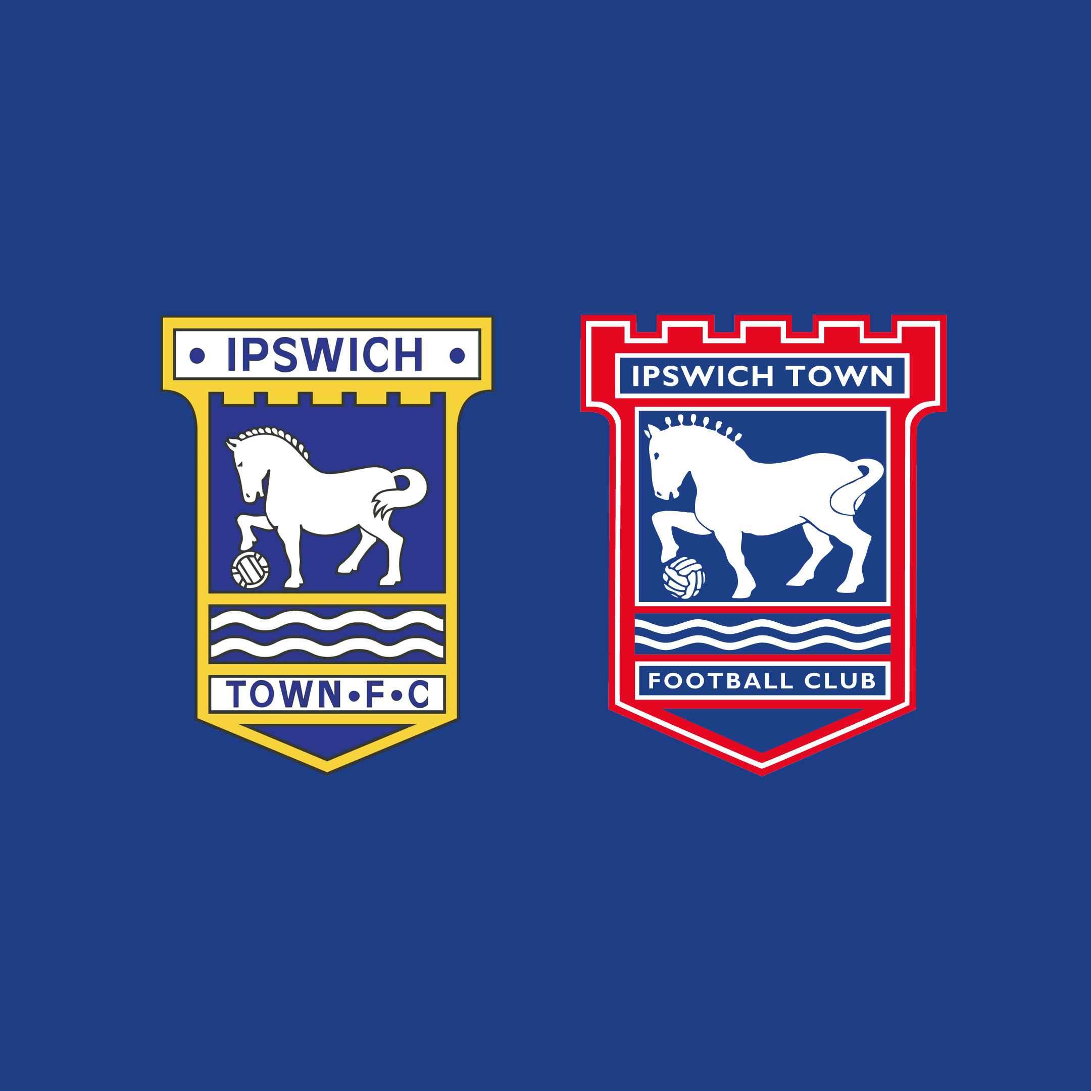
So, Norwich have a new crest (apologies for the provocative image, but it’s a conversation starter). Objectively, it's an overdue refinement, and as an Ipswich fan I can see us following suit before too long, with new owners keen to make upgrades throughout the club.
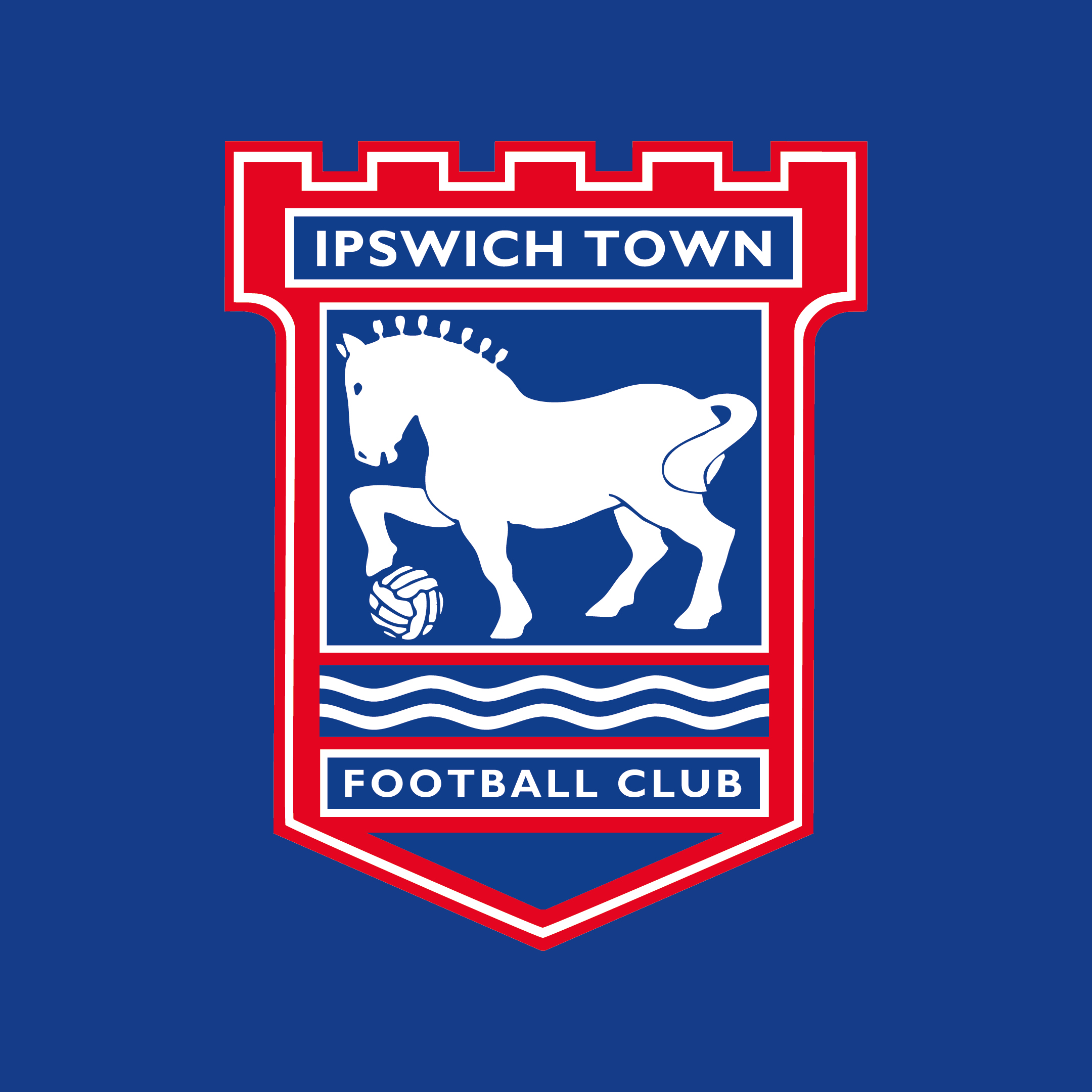
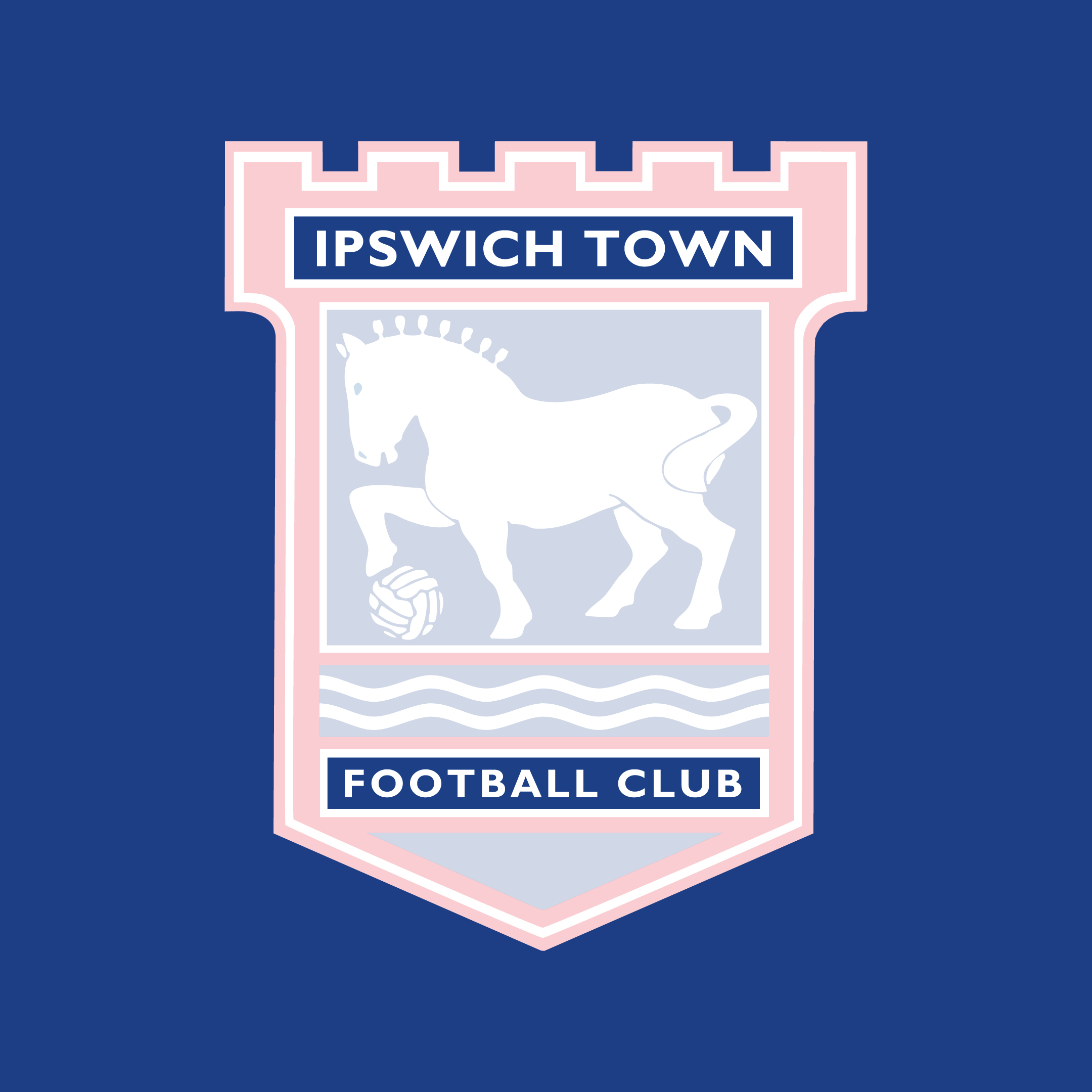
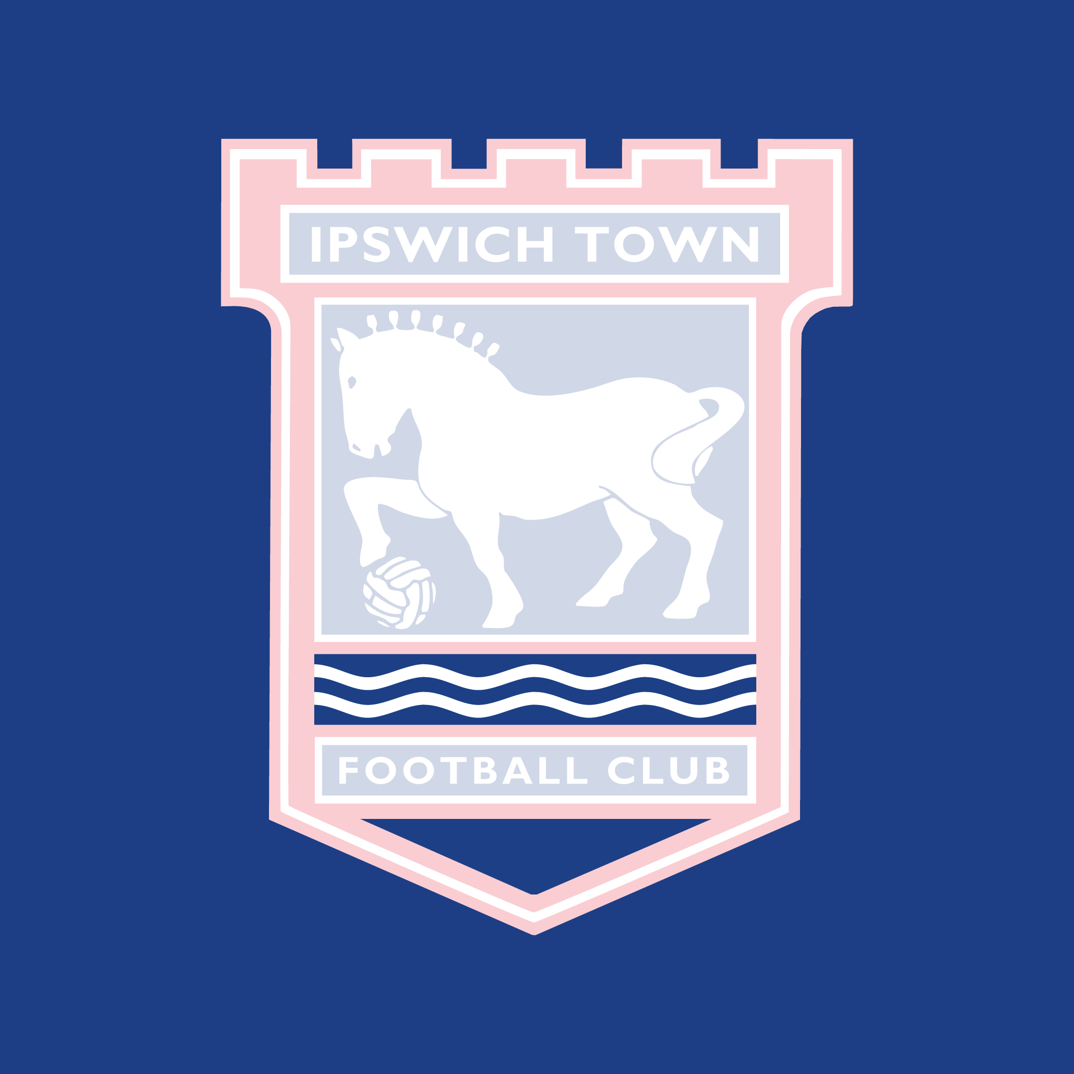
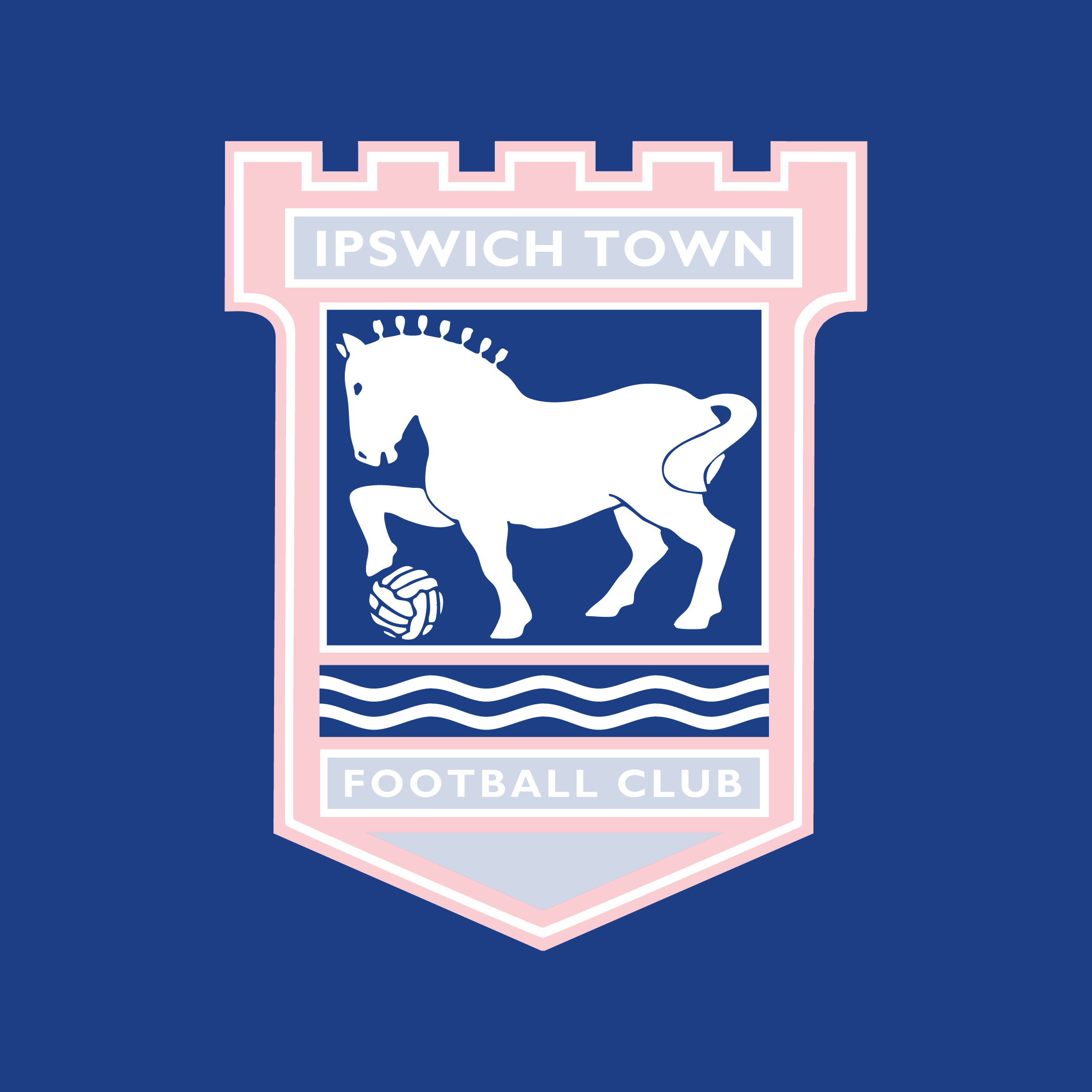
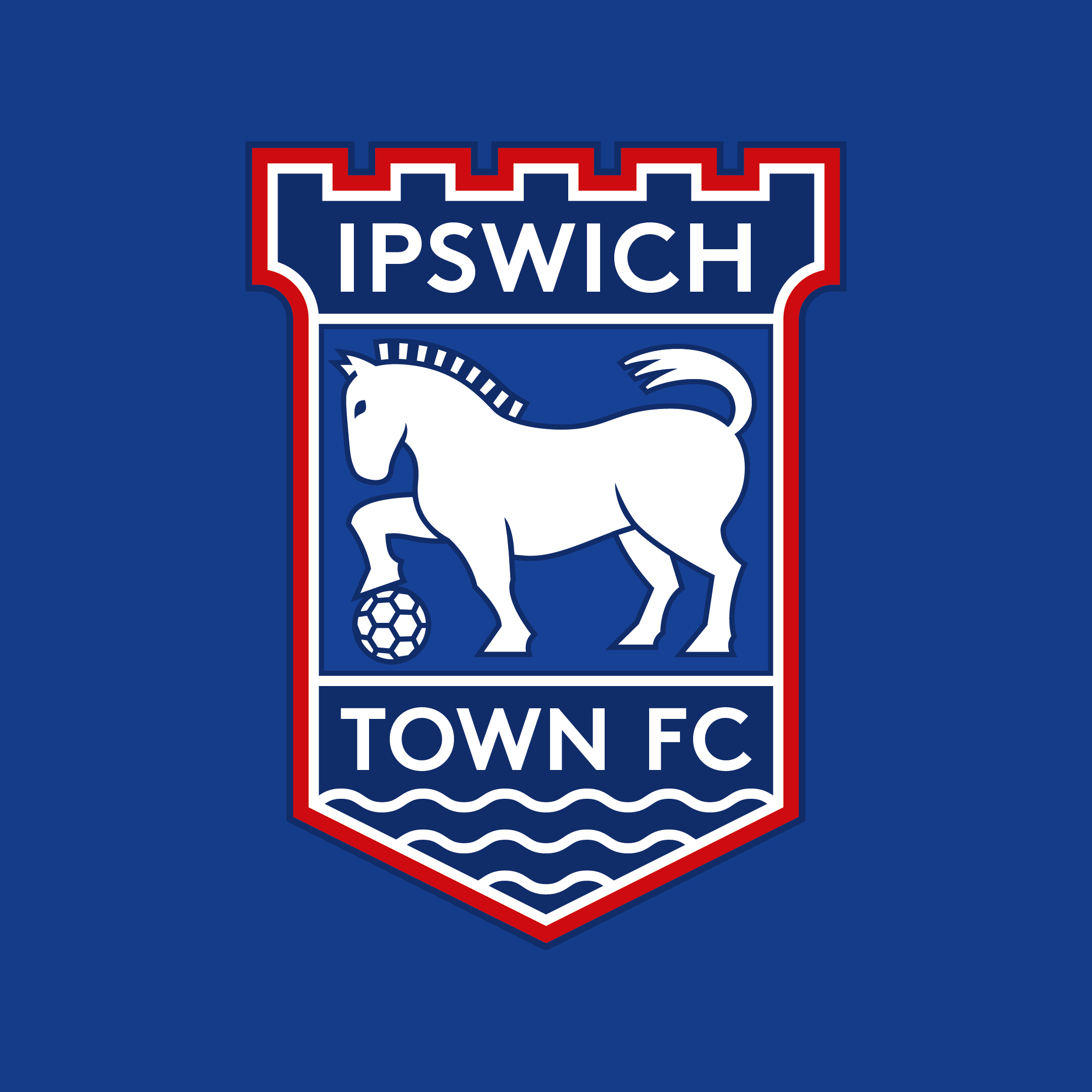
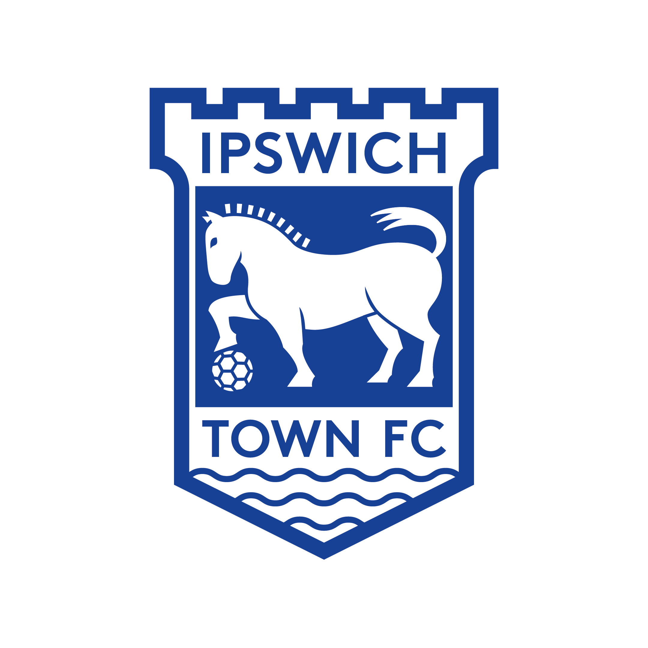
As a designer who works in branding, I’ve long thought Ipswich were due an improved crest. The current design has been in place since the 1995/96 season, and we’re now firmly in a digital age where the imperfections are plain to see. How could Ipswich improve their crest? Overall It’s worth pointing out from the start that I think our crest is in good shape and doesn't require a complete redesign. Some might see this as an opportunity to create something new and exciting, but I’m not one for throwing the club’s history and heritage out of the window. The overall shape is strong and unique. The icons themselves — the turrets, the Suffolk Punch horse with a football, and the sea waves — represent our club and location well. It’s more about how these ideas are executed. Typography The text is quite small and cramped. It uses the font Gill Sans, but has been stretched. As well as looking a bit messy, writing out 'Football Club' seems unnecessary and very few clubs do this. In terms of the typeface used, this speaks to a broader brand problem too, with an inconsistent approach to typography used by the club. Layout The main problems here are the waves sitting awkwardly under the horse with a blue background touching the red due to not having a white outline like the other boxes. This looks like a mistake, to me. Can the design have fewer 'boxes'? Can we make use of the empty triangular space at the bottom of the crest that’s currently redundant? Illustration The illustration of the horse isn't awful, but the details are intricate and less clear at small sizes. I believe the horse should clearly be a Suffolk Punch, but can we make it stronger and bolder? For me it should feel powerful and intimidating, without becoming a caricature. The horse sits within a rectangular space, leaving an empty blue area in the top right corner, can it fit the space better to give the crest a better balance? Also, the waves used are more like zig zags and don’t feel very natural. Colour Red replaced yellow in 1995/96, perhaps to differ more from the neighbours. But red has not always been used in kits and yellow is fondly associated with our club's biggest achievements. This aspect probably needs to be reviewed with the overall brand of the club going forwards in mind, but on balance, my instinct would be to stick with the red, in a reduced amount. A solution Overall, development is required but an overhaul isn't. I'd love a new crest that addresses these issues as part of a wider look at the club brand. The above is a relatively quick exploration of how that crest could look. It’s by no means finished, and would need lots of development with type designers to create a font for the brand and an illustrator to refine the horse. But as a starting point, I think it solves a lot of the key issues while keeping the core design the same. Some colour variants shown below (a single colour version would certainly be required).
Would love to know what fans think about updating the crest generally and what they'd like to see. Oliver Shilling is the founder of Middle Name (https://middlename.co.uk/), a branding and design studio.
Please report offensive, libellous or inappropriate posts by using the links provided.
SickParrot added 19:01 - Dec 7
Good idea. I like the changes you suggested.
|  |  1 1  |
lonepill added 23:48 - Dec 7
I think your design's great, the tail of the horse especially is fantastic. The ball is my least favourite part of the current badge, some criticisms I would either just leave the ball blank or with a simple + or x , or make a hexagon central in the middle of the ball just so it's symmetrical. Another would be to make the cut out on the back of the horse's left foot more prominent, and maybe see what it looks like when all the feet are level? And I also wonder if there's a way to incorporate the founding date without making it too busy. CONTACT THE CLUB WITH THESE DESIGNS! I do not trust the people running the club to select a badge revision (If they ever do) half as good as these, so contact the club and show them your ideas.
|  | 1 |
lonepill added 23:51 - Dec 7
^ The back of the horse's back left foot* to match the back right foot.
| | 0 |
DifferentGravy added 22:30 - Dec 8
Yeah have always preferred the yellow n blue badge. Not a fan of the red n blue.
| | 4 |
BlueSwede added 18:27 - Dec 11
Don't feel any need for a change. Like the weight in the badge we have now compared to the one you suggest and like the open space above the horse. Keeps the tail in the right position as well. Also like the old ball to signal our history. But would like the yellow back though. Also a signal to our history.
| | 2 |
Europablue added 23:35 - Dec 12
I would argue that the very idea of a club crest for the 21st century makes no sense. I don't see the improvement in the Norwich badge. The key point of a club crest is to express the identity and history of the club. The Ipswich crest is a great design feat. I see the current version as an improvement of the old yellow one just because the castle part looks a lot better as a part of the shield at the top.
The designs above look really old fashioned to me, and I find the empty triangular space to be powerful and filling it with waves looks messy to me.
Continuity of the crest is an embodiment of the value of the club in that it is an ever-present part of Ipswich.
Thanks for the article, it was a very interesting idea to explore nonetheless.
| | -1 |
Europablue added 23:44 - Dec 12
I do like the idea of adding 1878 to the space in the triangle, and I don't like the mane of the current punch. Otherwise, leave it well alone.
| | -1 |
StavangerBlue added 14:58 - Dec 13
I believe we should keep the design as is. It is unique. What I would change is the colour scheme. I would revert back to yellow, white and blue.
Then on the kits, I would make it larger. The modern kits have tiny little badges. I want to see a larger crest that shouts Ipswich Town.
|  | 2 |
BurleysGloryDays added 17:46 - Dec 13
Great topic to raise Oliver.
I have also never been a fan of the current crest, nor the red on it. Yellow and blue much more interesting (and I reject association with them up the road, who are distinctively yellow and green). It'd be no more an association than rivals Arsenal, Liverpool and Man U all using red.
Most of your changes are significant improvements, I would argue. And it should open the debate more fully to get more designers on the case.
I don't think it's fair to suggest the new owners should be driving this, I think the fans should be too - the owners will be cautious of changes like this - but the fans can encourage them and give them license to do it.
In my opinion, it needs it. It'd be a welcome progressive step. And the fans could vote from a shortlist. The season ticket holders should be allowed to do that perhaps, as a thank you for seeing the club through some tough years.
For what it's worth, I liked the minimalist blue on white background as well as the return of the yellow.
#BinTheRed : )
| | 3 |
Cakeman added 19:47 - Dec 13
Sorry Westy I marked you down by mistake.
|  | 0 |
Kitman added 08:12 - Dec 14
If ever a new design is released, the Punch is essential as the main feature. It signifies strength and elegance. Two qualities we need to get back!
|  | 0 |
emergencylime added 10:42 - Dec 14
I agree an update is required. Mainly to digitise it. Like it or not, a logo, crest etc needs to be clear in the confines of an App icon on a smartphone.
I thought Fifeblue was harsh at first, but actually brings some good points to the discussion, especially in terms of the necessity to have text.
I disagree the horse is about to offload…I think the raised tail utilises the blank space well.
Finally, I concur that the Punch should stay. A Suffolk sheep is more widely known, but leaves us exposed to lazy stereotyping.
With that in mind, i agree that the horse should face right instead, as it currently seems to be either looking back longingly at distant glory, or generally representing going backwards not looking forward.
|  | 1 |
emergencylime added 10:49 - Dec 14
…i know I talked about what the crest would look like without text, but as an aside, i do like the revised font…reminds me of old Railway signs perhaps?
| | 0 |
Ravanelly added 09:11 - Dec 15
Sorry mate but I much prefer the current version to yours.
| | 1 |
My_Left_Foot added 13:35 - Dec 29
A bit suprised and disappointed with your result. As someone who works in branding, and in highlighting the resons a redesign might be considered, you've not addressed any of them. You've just recreated another badly drawn, over-complicated crest.
Branding a football crest is about stripping it back to the essentials - what are you trying to communicate? The Suffolk Punch - a county icon - strong, hardworking and noble, the waves - geographically locate the club (whether it's sea or river) - is the football needed? Debatable. The name is of a football club, so it's not essential (car companies don't have logos that look like cars). So there are your essentials - now remove the rest of the clutter, the castlations (we have no castle in Ipswich), all of the lines etc - it'll still be an evolution.
If they ever think about redesigning it, hopefully they'll engage with the key stakeholders, as all rebranding projects should, but in football's case, the stakehiolders are far more passionate about their 'logo' than any employees of a business are. Ask the agency that tried to rebrand Everton without involving the fans! - Lee (Creative Director of 30 years, 3 times D&AD winner, 15 Design Effectiveness Awards)
| | 0 |
oshilling_coyb added 09:29 - Dec 31
Thanks for the comment, Lee. I’ll only re-state that this was a quick exploration to evolve the current crest and to explain the weaknesses in the design, of course there are countless possibilities to improve and take it further. That said, I disagree that ‘stripping back to the essentials’ is the sole aim, when a club’s heritage is sometimes the cost. As you rightly point out, this means more than a corporate logo, so while some details may seem superfluous or lack meaning (turrets), they’re unique and now carry meaning through being part of the crest for 50 years. Exploring what it could look like in its simplest form would of course be part of the process, and I agree that fans should be consulted at key stages too. If you want to pitch for it, let me know :)
| | 0 |
chilli added 10:03 - Jan 1
Some good thoughts but don’t like any of the adaptations and certainly not tail up (if that was meant to suggest having our tails up?) My money is on an American style rounded shield similar to Everton one coming in. Might give it a go though. HNY.
| | -1 |
OriginalPaul added 20:19 - Jan 2
I really like the current badge, but there’s always room for improvement, and certainly any change will be controversial because you can’t please everyone. The last change, which I remember well, was - relatively speaking - fairly minor but I do think it made the badge bolder, which is what the Club said at the time. I hate yellow, and while I know it used to be a common away kit colour for us back in the day, I wonder how many of our fans today remember it? I only remember seeing it in pictures and I’ve been going for 40 years.
With my web designer hat on (I’m not a graphic designer though!) I agree with your point about typography. It could be cleaner and more consistent across the “brandâ€. But does that mean the “IPSWICH TOWN FOOTBALL CLUB†on the Cobbold needs changing too? It’s kind of iconic from all the squad posters.
I very much disagree with the need to use every space. From a web design perspective, adding space is one of the most beneficial things you can use. It helps make things look simpler and less cluttered. That’s not to say it should be wasted, but used wisely. I think it’s used fairly well, and leads to a unique shape.
The horse could be flipped to “look forwardâ€. In the West, we write left to right, which is why it’s perceived as flipping the horse could be forward looking. If (as seems to be the way of things) we want to appeal to an Asian market, perhaps facing left is actually best ;-)
Anyway, just my thoughts. It’s thought provoking, but would need an awful lot of thought and work.
| | 0 |
Dissboyitfc added 07:45 - Nov 6
the badge has been redisigned many times so hardly sacred is it! Got no problems with it being updated!
|  | 0 |
raycrawfordswig added 00:28 - Nov 7
Sorry but the Horse with its tail up looks like it’s about to have a DUMP.
|  | 0 |
You need to login in order to post your comments |
Blogs 295 bloggers |