The ITFC Crest: time for an update?
Written by oshilling_coyb on Friday, 3rd Dec 2021 17:00
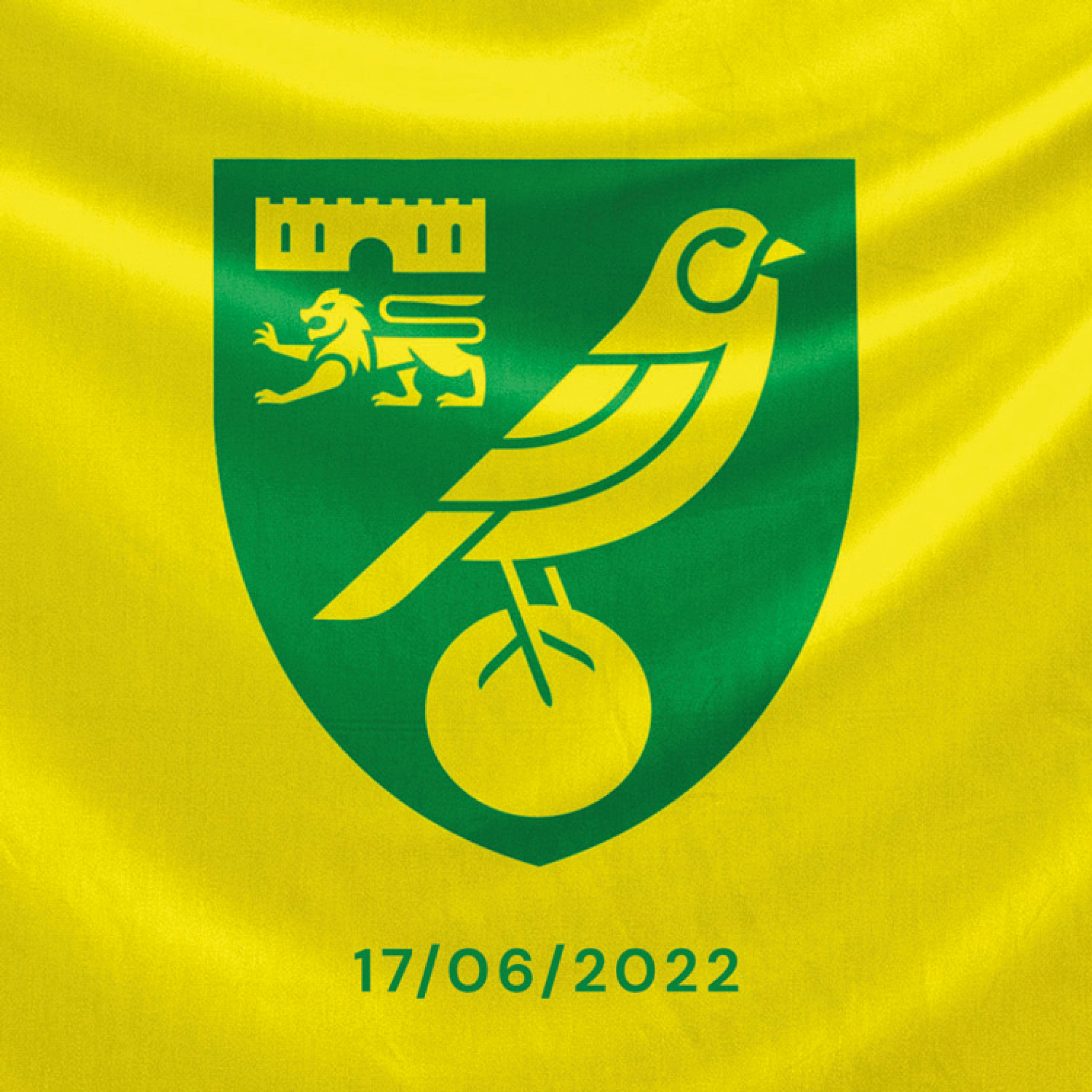
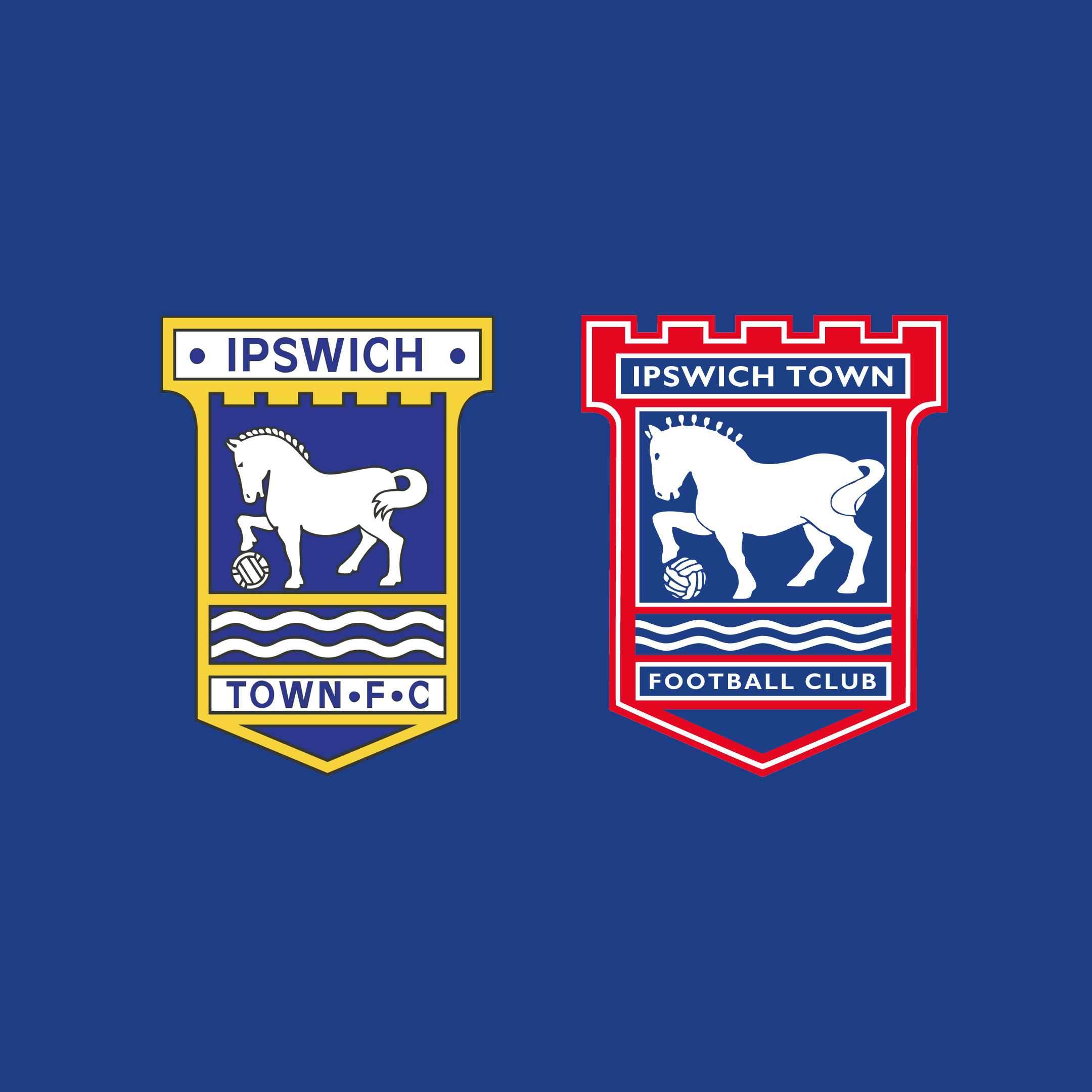
So, Norwich have a new crest (apologies for the provocative image, but it’s a conversation starter). Objectively, it's an overdue refinement, and as an Ipswich fan I can see us following suit before too long, with new owners keen to make upgrades throughout the club.
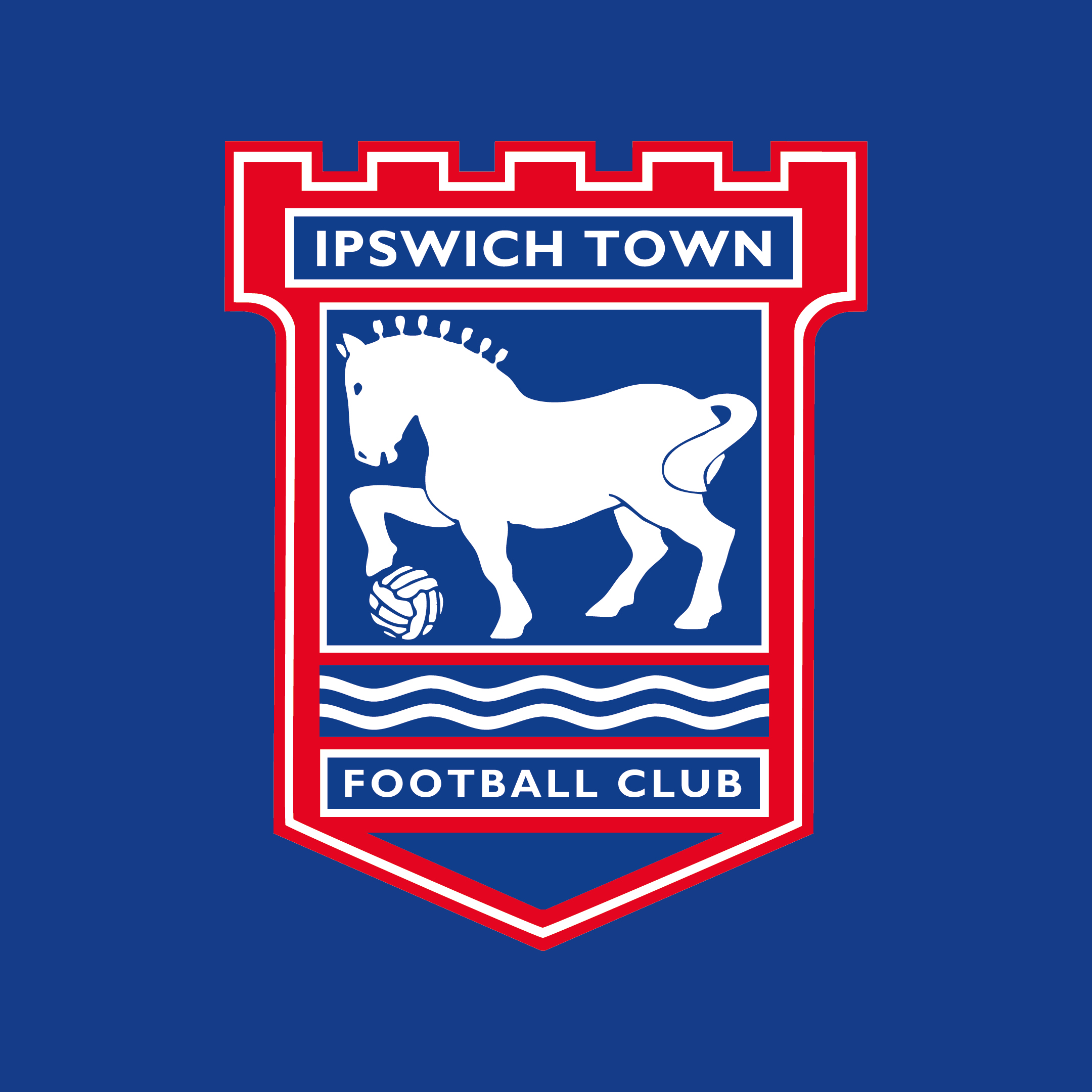
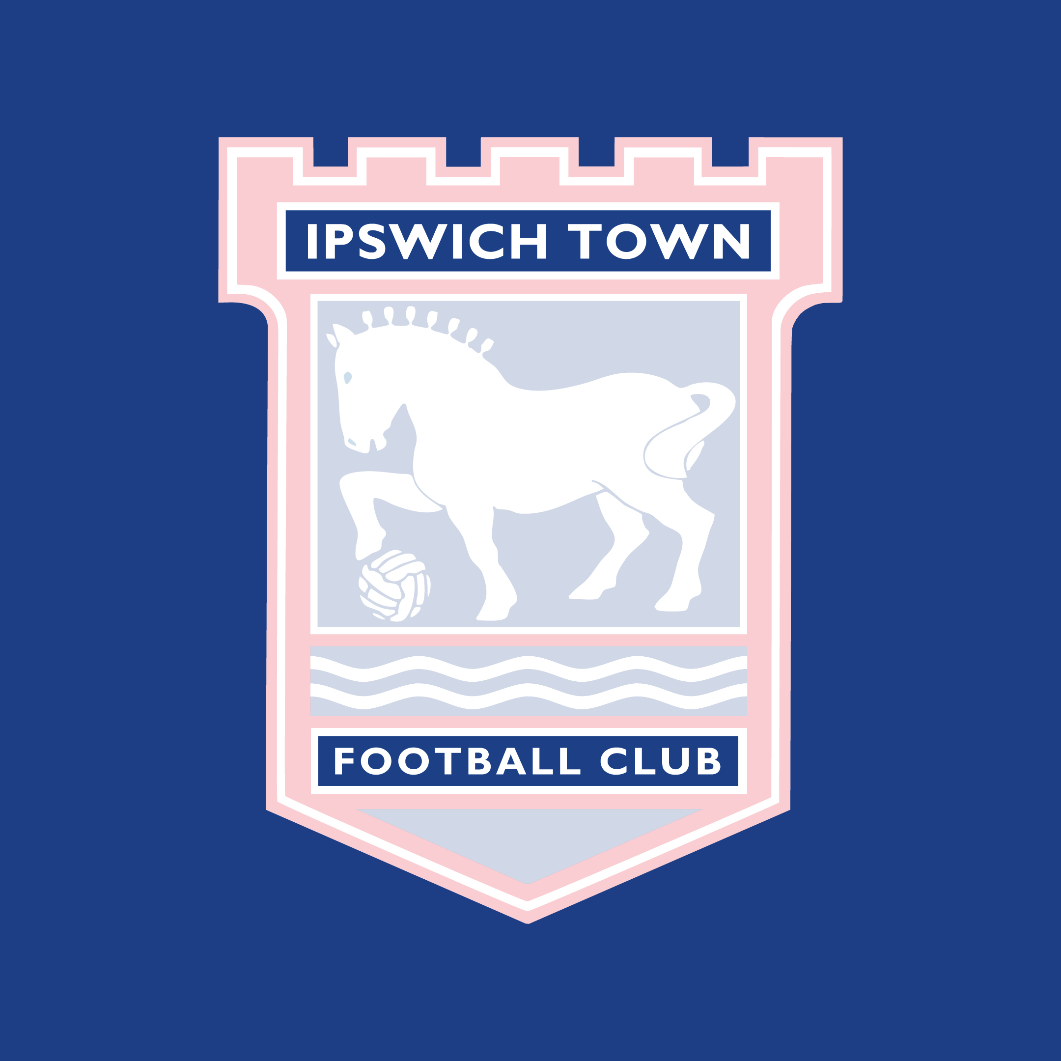
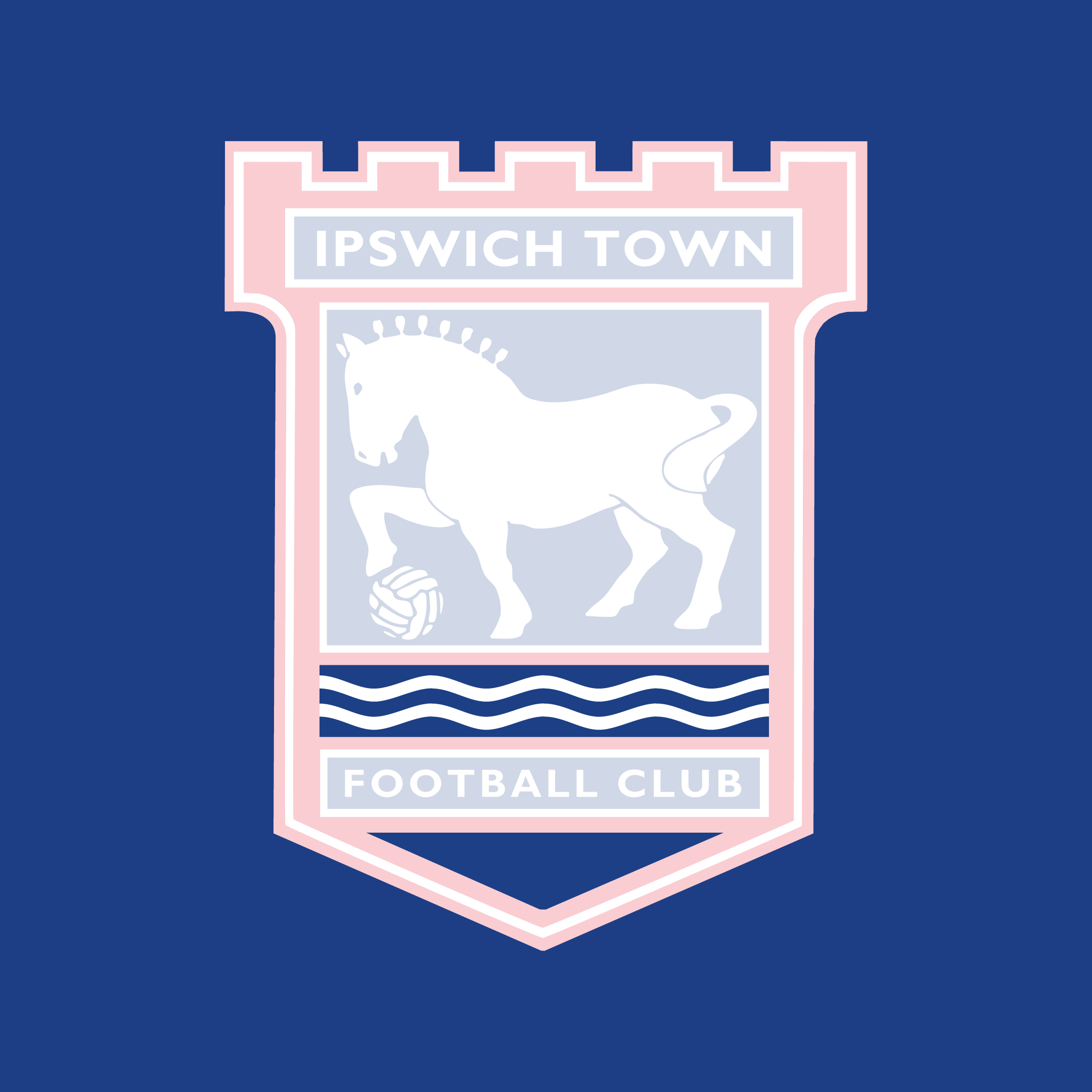
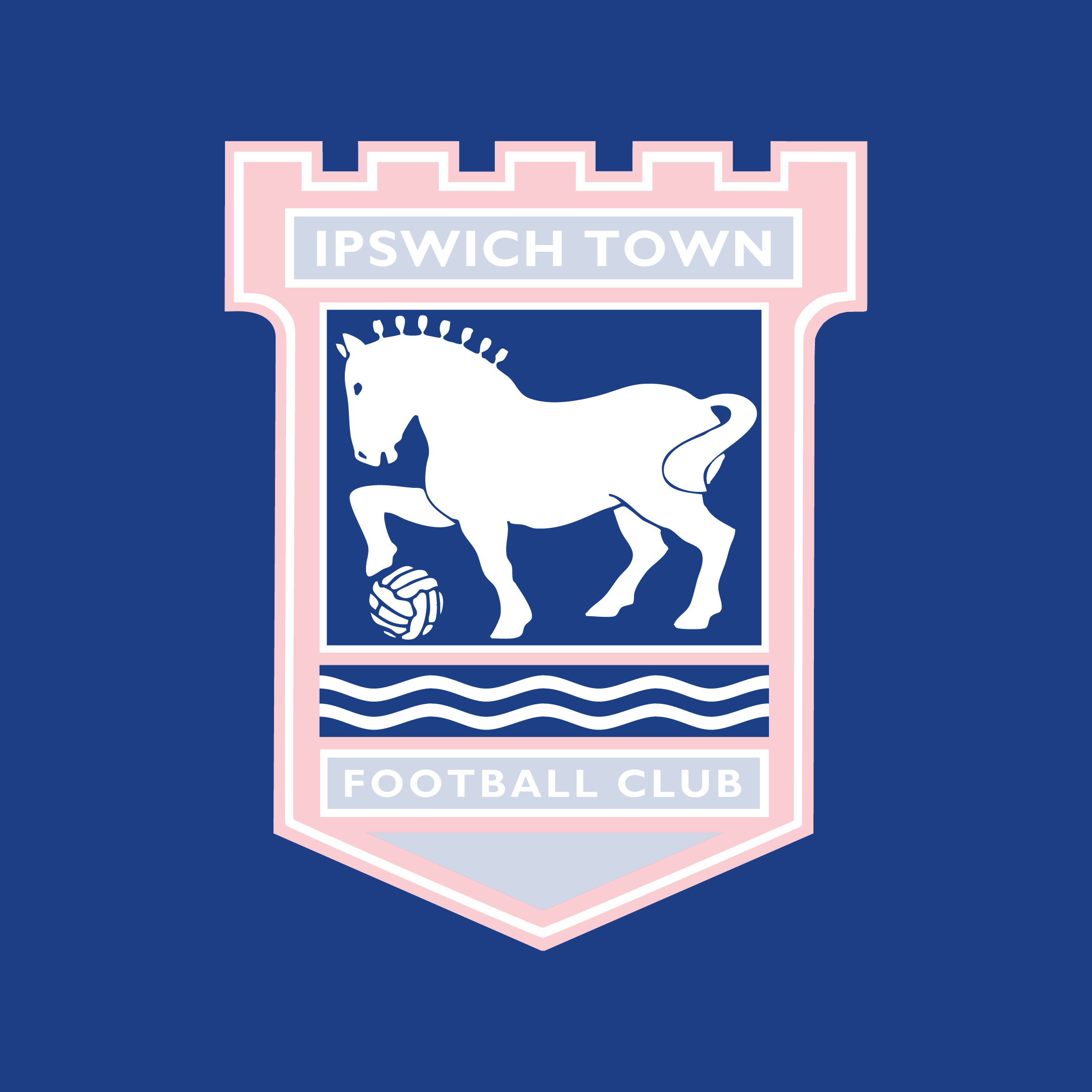
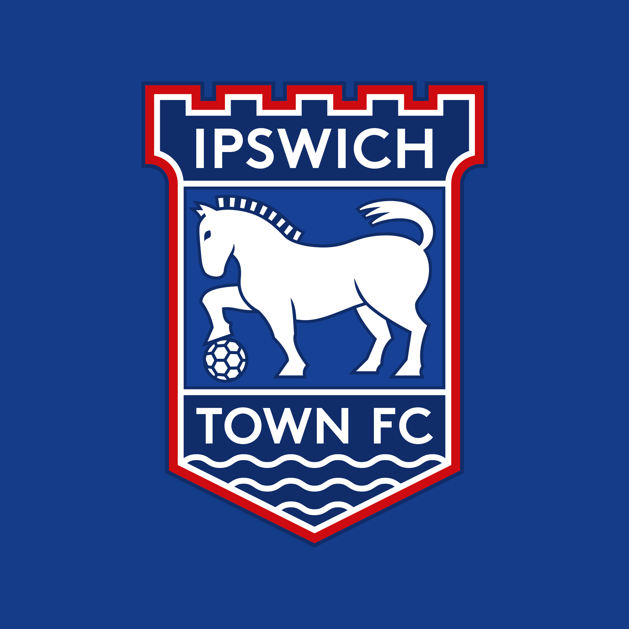
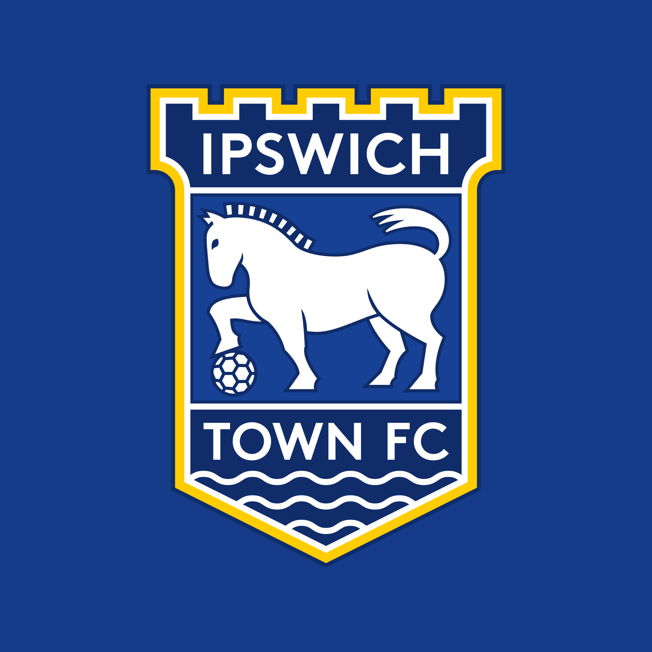
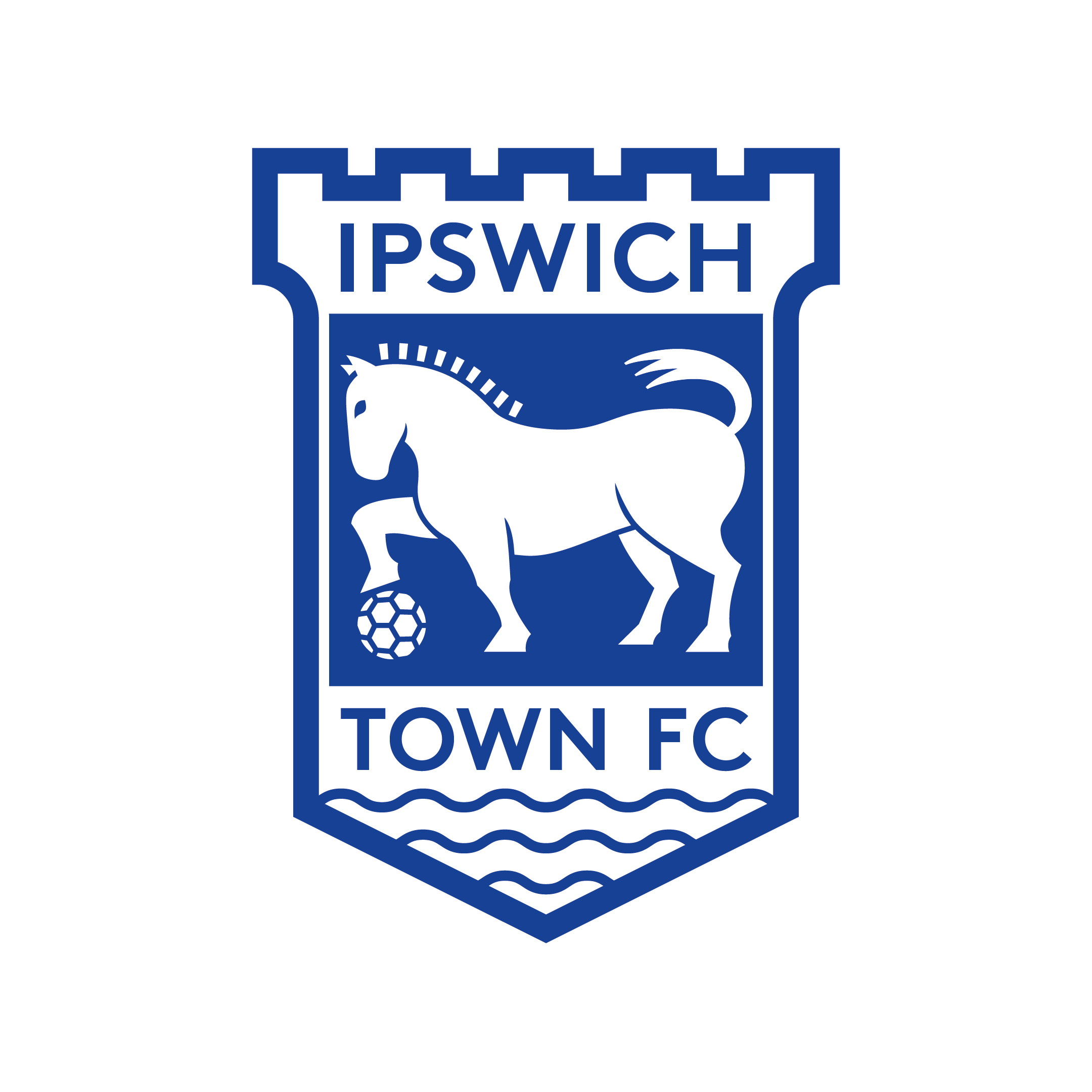
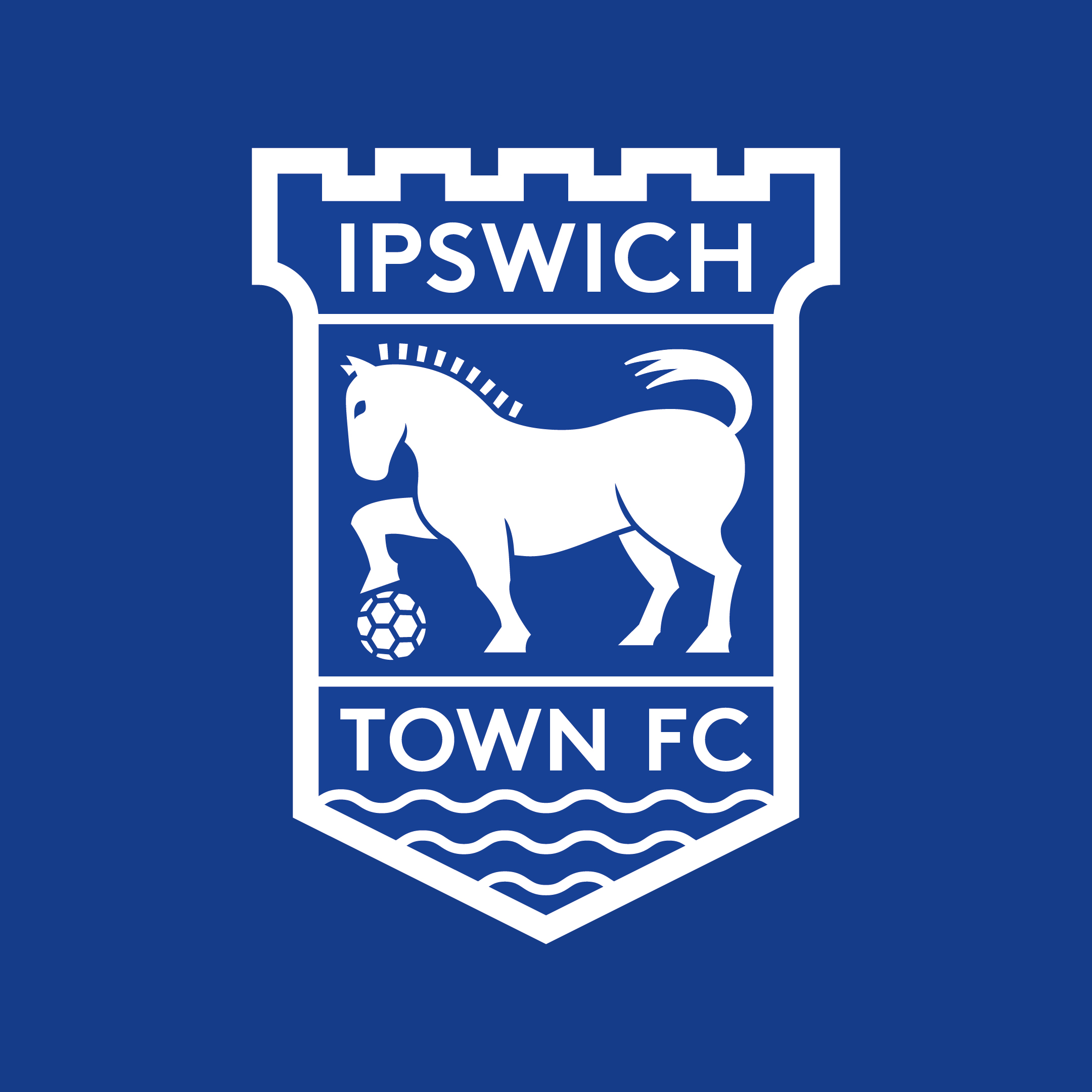
As a designer who works in branding, I’ve long thought Ipswich were due an improved crest. The current design has been in place since the 1995/96 season, and we’re now firmly in a digital age where the imperfections are plain to see. How could Ipswich improve their crest? Overall It’s worth pointing out from the start that I think our crest is in good shape and doesn't require a complete redesign. Some might see this as an opportunity to create something new and exciting, but I’m not one for throwing the club’s history and heritage out of the window. The overall shape is strong and unique. The icons themselves — the turrets, the Suffolk Punch horse with a football, and the sea waves — represent our club and location well. It’s more about how these ideas are executed. Typography The text is quite small and cramped. It uses the font Gill Sans, but has been stretched. As well as looking a bit messy, writing out 'Football Club' seems unnecessary and very few clubs do this. In terms of the typeface used, this speaks to a broader brand problem too, with an inconsistent approach to typography used by the club. Layout The main problems here are the waves sitting awkwardly under the horse with a blue background touching the red due to not having a white outline like the other boxes. This looks like a mistake, to me. Can the design have fewer 'boxes'? Can we make use of the empty triangular space at the bottom of the crest that’s currently redundant? Illustration The illustration of the horse isn't awful, but the details are intricate and less clear at small sizes. I believe the horse should clearly be a Suffolk Punch, but can we make it stronger and bolder? For me it should feel powerful and intimidating, without becoming a caricature. The horse sits within a rectangular space, leaving an empty blue area in the top right corner, can it fit the space better to give the crest a better balance? Also, the waves used are more like zig zags and don’t feel very natural. Colour Red replaced yellow in 1995/96, perhaps to differ more from the neighbours. But red has not always been used in kits and yellow is fondly associated with our club's biggest achievements. This aspect probably needs to be reviewed with the overall brand of the club going forwards in mind, but on balance, my instinct would be to stick with the red, in a reduced amount. A solution Overall, development is required but an overhaul isn't. I'd love a new crest that addresses these issues as part of a wider look at the club brand. The above is a relatively quick exploration of how that crest could look. It’s by no means finished, and would need lots of development with type designers to create a font for the brand and an illustrator to refine the horse. But as a starting point, I think it solves a lot of the key issues while keeping the core design the same. Some colour variants shown below (a single colour version would certainly be required).
Would love to know what fans think about updating the crest generally and what they'd like to see. Oliver Shilling is the founder of Middle Name (https://middlename.co.uk/), a branding and design studio.
Please report offensive, libellous or inappropriate posts by using the links provided.
fifeblue added 18:58 - Dec 3
I am not at all convinced that the current crest has issues but if it does then I am not convinced that you ideas solve any of them.
For example:
The text: 1) Why have any at all? 2) The current one improved the previous one in one simple way, by putting TOWN alongside IPSWICH - TOWN FC looked awful (IMHO) and you have gone back to it. 3) Why bother with FC if there is any text anyway?
The waves: 1) I think it represents the river, not the sea but that is incidental. 2) Your revised design makes it look like the club is sinking into the waves - of course, it could be interpreted in a number of ways.
The horse: Your Suffolk Punch is not really any different considering your criticism of the current crest.
The Turrets: 1) This link would be lost on the vast majority of people these days but I do think it is better than the previous flat-topped crest.
I applaud any thoughts and ideas to improve any aspect of the club and you have written an interesting and thought-provoking column.
One last thought of my own:
The general shape of the crest: 1) why bother with the separate sections inside it at all? 2) In fact, why bother with ANY outline at all? Try experimenting with getting rid of ALL the straight lines and borders and avoid the need for yellow, red or any secondary colour at all?
Fun read, in any case.
JJ
|  |  1 1  |
fifeblue added 19:04 - Dec 3
One last thing!
The Suffolk Punch would be improved if it were facing RIGHT, not LEFT and perhaps even kicking the ball, not trapping it and maybe have the head pointing upwards or at least more forwards. This would indicate a forward-thinking club.
Don't be restricted by the past. Think pisitively about the future!
JJ
| | 1 |
fifeblue added 19:05 - Dec 3
Er ... POSITIVELY!
| | 0 |
oshilling_coyb added 19:46 - Dec 3
fifeblue. Lots of interesting viewpoints. I can answer many of them by clarifying that this exploration was focused on developing our existing crest, rather than creating a new crest. And so with regards to the elements you've suggested could be pushed further or removed entirely, I asked myself, 'do we need to?', when most fans are very against any change at all. So my approach was to solve the problems outlined with minimal intervention on the overall design. Also, this was a short, fun experiment. If this were a professional project of mine, it would rightly consider far more variables and explore them in-depth. But for now, it's just a couple of evenings' work. The original designer did say the waves were inspired by the sea: https://thebeautifulhistory.wo My comments on the horse (to make it work at smaller sizes / stronger and bolder / to adjust to fill the space) are certainly rectified, in my opinion. The idea that the horse facing right is more 'forwards' is an interesting one. Spurs, Liverpool and Villa may disagree. | | 1 |
fifeblue added 19:55 - Dec 3
Thanks for your considered response.
As for Spurs, Liverpool, Villa ... who cares! We are IPSWICH TOWN! Onwards and upwards!
| | 0 |
oshilling_coyb added 20:43 - Dec 3
The question is, why does right = forwards and left = backwards if it does at all? It's an interesting one (for a designer looking at logos etc anyway).
| | 0 |
Cakeman added 21:27 - Dec 3
Some interesting takes on our crest which I do think needs an overhaul. I have never liked the current red one. I do like your designs with just Blue and White which make better use of space available too. Well done on raising an interesting topic.
|  | 5 |
Westy added 06:19 - Dec 4
Leave the crest alone. It's a great symbol of Suffolk and the town.
| | 1 |
SpiritOfJohn added 08:26 - Dec 4
My first reaction was 'why?' But now that we have American owners I wouldn't be too surprised if they changed the 'Ipswich brand' to make it simpler to recognise. Something along the lines of the Denver Broncos would be more dynamic.
|  | -1 |
ElephantintheRoom added 10:38 - Dec 4
Interesting read - but if you really do work in branding you have made some fairly basic mistakes - and dont seem to have reckoned on why the badge was created in the first place - nor what the designer at the time was trying to achieve. I'm not entirely convinced there is much to be gained by changing the badge - but I suspect you're right in that the new owners will want to tinker. The first step would be to create a brief - and bring in some of the who, what, when, where,why gibberish spouted by the bloke who thought a team was being built at Ipswich. If you recall the badge was designed by combining some elements that were conveniently important - and somewhat tenuous. You could actually start again. it doesnt have to be shield-shaped. It doesnt have to be a horse... the suffolk punch was never much of a success - the suffolk sheep is a global success, and the suffolk red poll was a somewhat unique effort at livestock improvement too. There are two rivers in Ipswich, not one - which is uniquely interesting as a style cue - and Ipswich is in Suffolk - the badge could be Suffolk-shaped - it could be any shape. If we want reality to redesign the badge for the 21st century it isnt really Ipswich Town Football Club any more - its been through two offshore ownerships since then - and the current fan base seem happy to be based in Ohio, fronted by some Arizona opportunists and a complete employee list from elsewhere at the drop of the hat.... the rebrand could incluse a new name - Ipswich Town Franchise.... and have nothing to do with Ipswich whatsoever - people seem to tlike that. Personally I think the club ought to do what it is doing with the whitewashing outside the ground - and cherry pick the best bits of its heritage with more than a passing nod to the past - colour blue and white - and mine a passing reference to the Cobbolds who made the club what it was before it sank into obscurity and offshore ownership - perhaps a bottle top. It's probably the only way the club will be a top side again.
| | 0 |
slade1 added 17:29 - Dec 4
Just replace the Suffolk Punch with a knackered old Carthorse
| | 0 |
Paddy39 added 10:25 - Dec 5
Without the ear being drawn in properly the head looks like that of a Unicorn.
|  | 0 |
Saxonblue74 added 14:02 - Dec 5
The new Suffolk Punch looks like its had the "Kardashian" treatment!
| | 0 |
PrrrromotionGiven added 20:47 - Dec 5
Your first suggestion is the best imo. Nothing but blue and white is too minimalistic, and I just don't like the yellow much.
| | -1 |
bugblatter added 21:07 - Dec 5
I wrote a very similar piece back in May and made very similar observations. I like what you’ve done too, it’s interesting how we came to the same conclusion — the design does need some refining — the current typography is awful, and horse does need refining. http://www.comehitherdesign.co |  | 1 |
budgieplucker added 21:34 - Dec 5
Given Suffolk Punches were used to work the land and their work was replaced by the tractor, then I think it does fit with the history of the county and makes the more recently apt nickname of the tractor boys sync with the history. So keep the punch but maybe a more simplistic abstract version of the punch with simply ITFC initials.
|  | 0 |
budgieplucker added 21:42 - Dec 5
Good read and bugblatter thanks for the link, I have to the Spurs badge takes some bearing doesn’t it, just so simply
| | 1 |
budgieplucker added 21:44 - Dec 5
Damn predictive text……the spurs logo/badge takes some beating, just so simple
| | 2 |
Marcus added 22:35 - Dec 5
Don't like what you've done with the tail. Makes it look like Bluey is about to go for a dump.
|  | 3 |
Bluespeed225 added 12:30 - Dec 6
Only improvement to make is to revert back to the old (72-95) badge. It was perfect, didn’t need messing about with. Look at last seasons shirt to see just how it enhanced it!
| | 0 |
oshilling_coyb added 13:52 - Dec 6
Thanks for all the comments! Have enjoyed reading the various views on my designs and whether it's needed at all.
Although most fans seem keen to keep the badge as it currently is, it's worth noting that I think this is by far the least likely outcome over the next 10-20 years (maybe much less!). Any designer will tell you that the issues I've raised need fixing and increasingly so, and I'd be very surprised if an update, however small or large, isn't made in that timeframe.
And so, my 'exploration' was to make those improvements with as little change to the overall design as possible. I think this is important personally as it is undoubtedly a strong crest and resembles our club, I would hate to see a Leeds-style disaster. I do work in branding and of course this kind of project (when being paid for) is extensive, would involve a lot of research, consultations with fans as well as all stakeholders, and would explore lots of different approaches and outcomes (including some of your suggestions!).
This was just a short, fun bit of design, that hopefully gets fans thinking about what they would want to change, if anything, when the time comes.
Until then, I'm glad my Kardashian Unicorn doing a dump has provided some discussion!
[@bugblatter — someone brought this to my attention, and it's great to see aligned thoughts, some nice solutions there]
| | 2 |
ButchersBrokenNose added 17:38 - Dec 6
This is a very interesting and thought-provoking post. You clearly know what you're talking about, and I understand that what you have presented here are essentially a first draft. If the club was to pursue this, they would devote the resources you mention to it.
I really like our badge. Obviously, we're all subjective, but I think it's one of the best in Europe, so I would be hesitant to change it. That said, I didn't want to change the old yellow-bordered badge at the time, but I much prefer our current version now. Also, I had actually just been thinking about the dead space at the bottom of the badge, and shouldn't we do something about it. A change would allow us to address that. I like your ideas with the new variations, but I would prefer to keep some color in it.
When I think about other teams' badges, the ones I like serve as a link to the past, such as Liverpool or Man. Utd, but there are some traditional designs which clearly need updating, e.g. Newcastle. What I hope doesn't happen is a change such as at Fulham, which looks like a 12 year old came up an idea on the back of a napkin, or Arsenal, where they took a great-looking badge and made it into a cartoon).
Great job here.
|  | 1 |
KernewekBlue added 08:42 - Dec 7
I agree with you... the club crest could do with an overhaul.
There are inconsistencies in the current/old design that could be vastly improved with just a little thought and better use of the space, font & colour scheme.
A new crest for the modern age, with more appealing imagery, based on what we already have would be my own choice, although everyone else's perception and preferences may differ a little.
Let's do it!
|  | -1 |
Lightningboy added 14:39 - Dec 7
Should just go back to the “yellow†one from last season - “classicâ€.
|  | 0 |
You need to login in order to post your comments |
Blogs 297 bloggers |