| Colchester's 2025–26 away kit is... something 21:26 - Jul 21 with 5346 views | Miaow |

Complete with the usual guff:

Apologies if already posted. |  |
| |  |
| Colchester's 2025–26 away kit is... something on 17:38 - Jul 22 with 513 views | bournemouthblue |
| Colchester's 2025–26 away kit is... something on 22:16 - Jul 21 by bournemouthblue |
It's got the old Windows screensaver on it |
 |  |
| |
| Colchester's 2025–26 away kit is... something on 11:22 - Jul 23 with 430 views | MattinLondon |
| Colchester's 2025–26 away kit is... something on 13:16 - Jul 22 by FifeITFC |
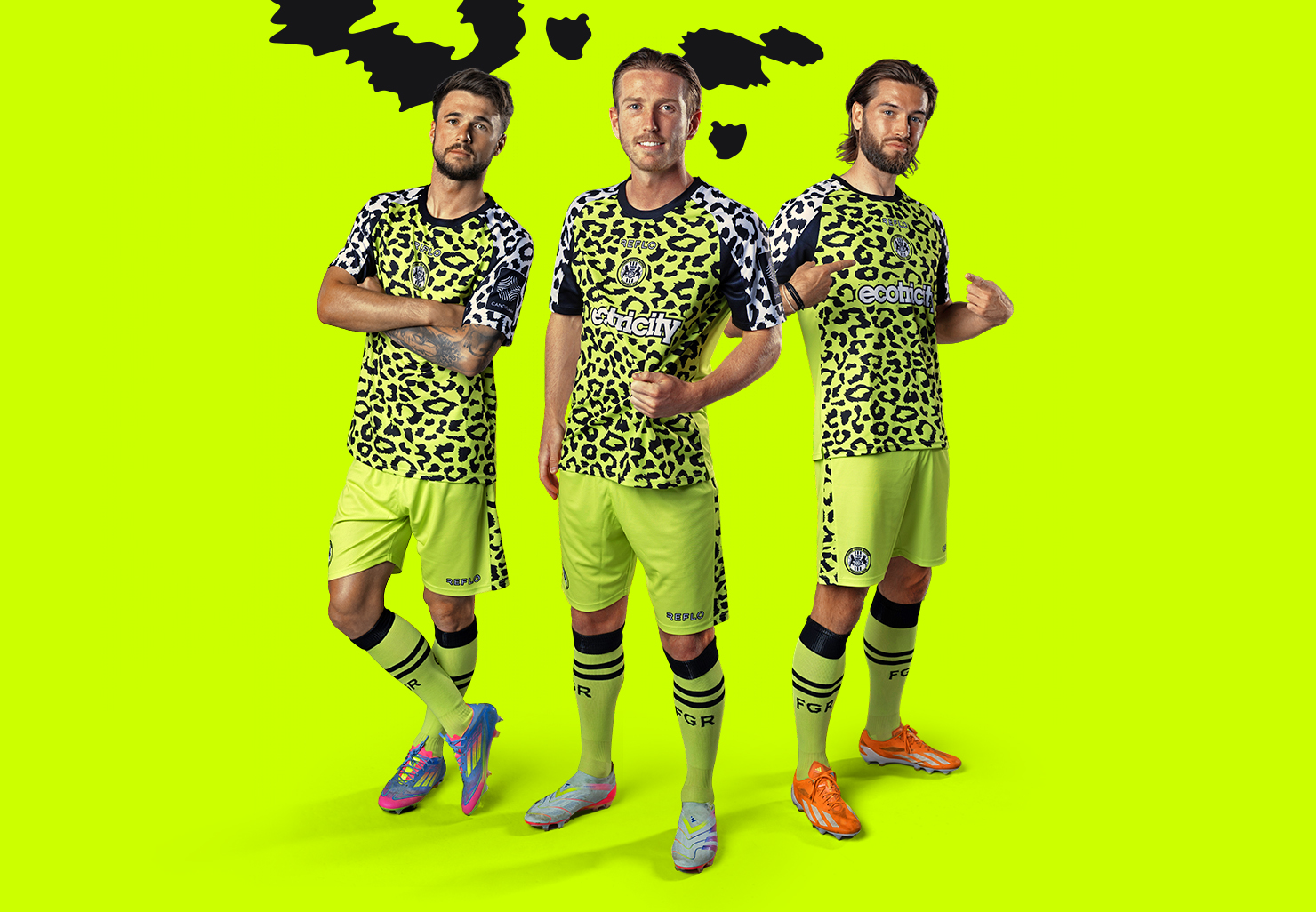
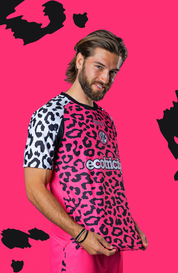
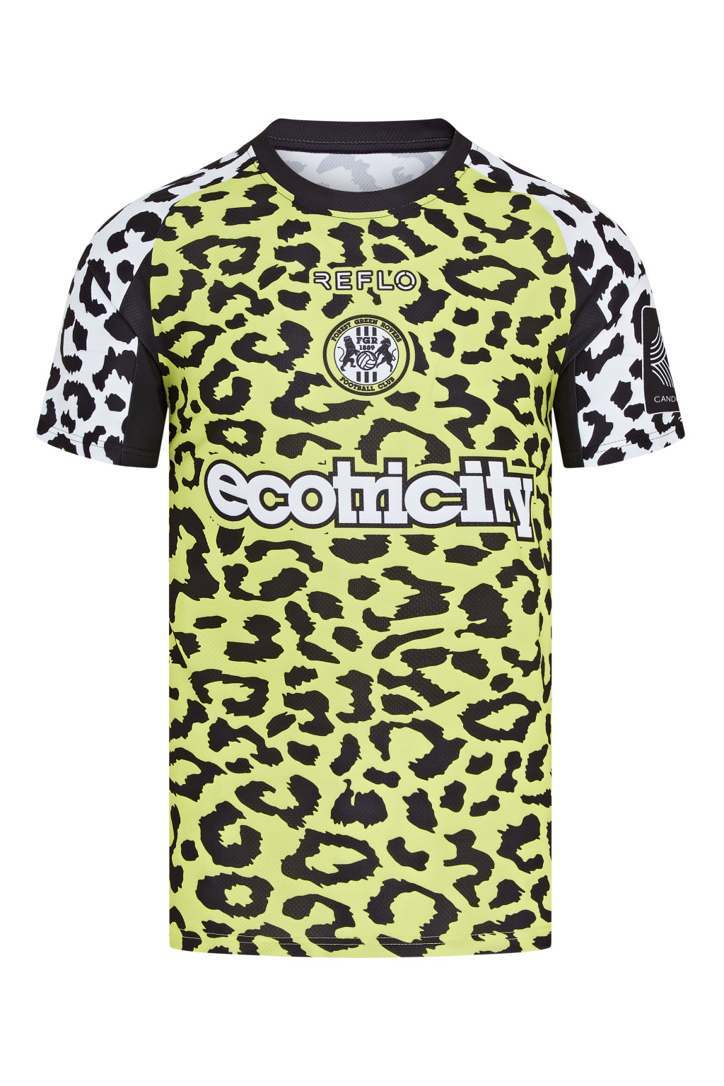
Surely a winner? |
Lovely kits. |  | | |
| Colchester's 2025–26 away kit is... something on 11:48 - Jul 23 with 397 views | MrBeckinsale |
| Colchester's 2025–26 away kit is... something on 13:16 - Jul 22 by FifeITFC |
Surely a winner? |
I assume no animals were harmed to get skin print for these? |  | | |
| Colchester's 2025–26 away kit is... something on 11:58 - Jul 23 with 381 views | Miaow |
| Colchester's 2025–26 away kit is... something on 11:47 - Jul 22 by MrBeckinsale |
The usual guff of saying it was inspired by this?
In that it has the same colours and badge but nothing else. SHouldn't that be 'vividly reimagined'?
 |
I just meant the typical spiel that clubs include in their statements when they unveil their new kits these days.
The sharp blue strokes are no longer rigid, they move with purpose and pace. A symbol of ambition, evolution, and the fearless hunger to rise once more.
See also:
 | |
| |
| Colchester's 2025–26 away kit is... something on 12:03 - Jul 23 with 359 views | bluearmy4838 |
That's horrendous, and the more I look at it the less I like it. The collar is horrible, sponsor looks naff, there's something about the sleeves I don't like as well, and as for that pattern...
Aside from the aesthetic it doesn't strike me as a good kit to play in. Its very busy, even in that picture it doesn't 'pop' enough off the backdrop. There's also a lot of blue in it which is their home kit (which is also really naff looking). And both their home and away has blue shorts. |  | | |
| |