| Looking at the new kit in these player snaps… 13% of fans disliking?! on 21:31 - Jul 2 with 2193 views | SitfcB |
Didn’t like the home shirt at first glance but now I’ve seen it in the flesh down at the shop it’s looking alright!!
Still think the white sleeves are a bit on the wide side! |  |
|  |
| Looking at the new kit in these player snaps… 13% of fans disliking?! on 21:36 - Jul 2 with 2122 views | unstableblue |
| Looking at the new kit in these player snaps… 13% of fans disliking?! on 21:31 - Jul 2 by SitfcB |
Didn’t like the home shirt at first glance but now I’ve seen it in the flesh down at the shop it’s looking alright!!
Still think the white sleeves are a bit on the wide side! |
Further snaps here Sitters (from KOA’s Rosco).
I think the width of the white sleeve is the thing people are getting caught on and the collar… but if sized right they actually look good
I think Clarke had a size too large in the launch photo shoot
I like it.,. Don’t love it… but I didn’t love last season either.. |  |
| |
| Looking at the new kit in these player snaps… 13% of fans disliking?! on 21:56 - Jul 2 with 2021 views | Sharkey |
It looks better when it's not phototographed in front of a white background. Sheeran looked like some kind of puppet with a very small body and a very big head. | 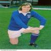 | | |
| Looking at the new kit in these player snaps… 13% of fans disliking?! on 22:12 - Jul 2 with 1926 views | Churchman |
What struck me was the differing opinions. Some don’t like collars on shirts, others don’t like them without (me included). Many liked last years shirt with graphics all over it, others prefer plain panels. The badge is too to the right, the logo too big, stripes too wide, too white, too stripey, collar colour, you name it.
You’re never going to please everybody but I do find the word ‘hate’ used against it surprising. It’s pretty innocuous to my eye and it’s the right shade of blue. But it’s all about opinions. |  | | |
| Looking at the new kit in these player snaps… 13% of fans disliking?! on 22:15 - Jul 2 with 1921 views | Rozz |
I'm coming around to the home shirt. Something on the arms doesn't look right and I think I've decided that they should have either included a red piping on the edge of the white panels, or a red stripe around the collar.
Away is nice. Probably my favourite of the current era. |  | | |
| Looking at the new kit in these player snaps… 13% of fans disliking?! on 22:28 - Jul 2 with 1864 views | Churchman |
| Looking at the new kit in these player snaps… 13% of fans disliking?! on 22:15 - Jul 2 by Rozz |
I'm coming around to the home shirt. Something on the arms doesn't look right and I think I've decided that they should have either included a red piping on the edge of the white panels, or a red stripe around the collar.
Away is nice. Probably my favourite of the current era. |
No red piping for me! Reminds of the hapless relegation team kit. We don’t play at home in red!
In fact, the home kit shouldn’t have any red at all and that includes the badge - I prefer the previous 70s/80s one.
Opinions, huh. | | | |
| Looking at the new kit in these player snaps… 13% of fans disliking?! on 22:36 - Jul 2 with 1828 views | Illinoisblue |
I don’t like it. Too much white. Collar unnecessary. |  |
| |
| Looking at the new kit in these player snaps… 13% of fans disliking?! on 23:13 - Jul 2 with 1723 views | SlippinJimmyJuan |
Small sample size, but I saw that someone posted a picture of the home shirt to the Championship subreddit. Nearly every comment from fans of other clubs was that it looked great. Think it is proving more divisive among Town fans as last year's home kit was so popular. I've ordered an away, but I do like the home. |  |
| |
Login to get fewer ads
| Looking at the new kit in these player snaps… 13% of fans disliking?! on 13:47 - Jul 3 with 1119 views | geg1992 |
| Looking at the new kit in these player snaps… 13% of fans disliking?! on 22:36 - Jul 2 by Illinoisblue |
I don’t like it. Too much white. Collar unnecessary. |
My thoughts too... although it's growing on me. |  |
| |
| |