By continuing to use the site, you agree to our use of cookies and to abide by our Terms and Conditions. We in turn value your personal details in accordance with our Privacy Policy.
Please log in or register. Registered visitors get fewer ads.
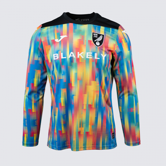
Closer inspection shows a racing flag style check pattern in the background.
I really hope this was designed to be tie in shirt with lotus who are still inside their 75th anniversary year and it's all gone tit's up on the sponsor deal. I can think of no other reason why that pattern is in that shirt.
The kit is bland and vile in colour also...
1
Norwich home shirt on 20:01 - Jul 5 with 2846 views
I suppose it's better than the thing they wore last year which (and I promise this is a completely unbiased view) was a hideous mis-design after an accident at a ladder factory.
The poor sods; they have to deal with their colour scheme AND they use that Joma manufacturer whose logo looks like it was created by the second most talented five year old in the design class.
I think the Joma logo is the worst bit of design I have ever seen in any field.