| Font/typeface 18:52 - May 5 with 1415 views | dominiciawful |
Anybody else noticed the lettering used by the club in their media output lately? Seems to be that which is on the back of the West Stand.

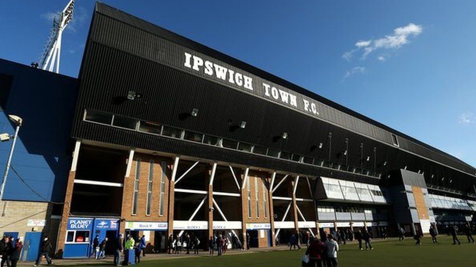
Nice that they seem to be trying to get a joined-up club lettering identity thingamabobby. |  |
| |  |
| Font/typeface on 19:12 - May 5 with 1354 views | Lord_Lucan |
They mentioned that they loved the font as soon as they saw the Cobbold stand, one of the directors wives said "Do not get rid of that font"
At least I think it was a wife but it was definitely said. |  |
| |
| Font/typeface on 19:13 - May 5 with 1340 views | Illinoisblue |
Any design types know what the font is called? |  |
| |
| Font/typeface on 19:15 - May 5 with 1335 views | PhilTWTD |
| Font/typeface on 19:12 - May 5 by Lord_Lucan |
They mentioned that they loved the font as soon as they saw the Cobbold stand, one of the directors wives said "Do not get rid of that font"
At least I think it was a wife but it was definitely said. |
Mark Ashton, at his first press conference.
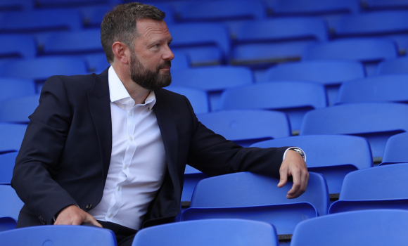 Ashton: Too Big an Opportunity to Turn Down 1st Jun 2021 14:55Incoming Blues CEO Mark Ashton says it was time for a new challenge and Town was too big an opportunity to turn down following five and a half years at Bristol City. Ashton: Too Big an Opportunity to Turn Down 1st Jun 2021 14:55Incoming Blues CEO Mark Ashton says it was time for a new challenge and Town was too big an opportunity to turn down following five and a half years at Bristol City.  24 24
|  | | |
| Font/typeface on 19:17 - May 5 with 1325 views | footers |
| Font/typeface on 19:13 - May 5 by Illinoisblue |
Any design types know what the font is called? |
Neue Aachen Pro Semibold, apparently. At least the top image.
Although I'm sure a proper design bod will be along shortly to correct me! |  |
| |
| Font/typeface on 20:01 - May 5 with 1224 views | Fixed_It |
| Font/typeface on 19:17 - May 5 by footers |
Neue Aachen Pro Semibold, apparently. At least the top image.
Although I'm sure a proper design bod will be along shortly to correct me! |
Hoppy! |  |
| |
| Font/typeface on 20:33 - May 5 with 1159 views | DJR |
| Font/typeface on 19:12 - May 5 by Lord_Lucan |
They mentioned that they loved the font as soon as they saw the Cobbold stand, one of the directors wives said "Do not get rid of that font"
At least I think it was a wife but it was definitely said. |
However the font on back of the Cobbold Stand appears to be different to that on the back of the Sir Alf Ramsey stand. You can see that font from the station. It is a mixture of upper and lower case, and I believe it was changed sometime early in the season. [Post edited 5 May 2022 20:34]
|  | | |
| Font/typeface on 20:42 - May 5 with 1119 views | footers |
| Font/typeface on 20:01 - May 5 by Fixed_It |
Hoppy! |
Excuse me, but aren't we asking for advice on fonts and not cheap jokes? | |
| |
Login to get fewer ads
| Font/typeface on 21:15 - May 5 with 1066 views | xrayspecs |
Spurs have developed their own bespoke font which they use on all comms, including stadium signage. |  | | |
| Font/typeface on 21:47 - May 5 with 1021 views | Illinoisblue |
| Font/typeface on 21:15 - May 5 by xrayspecs |
Spurs have developed their own bespoke font which they use on all comms, including stadium signage. |
Proper branding and identity is what a professional organization should embrace. Obviously for us it’s not THE most important thing but still important. | |
| |
| Font/typeface on 07:49 - May 6 with 801 views | hoppy |
| Font/typeface on 19:17 - May 5 by footers |
Neue Aachen Pro Semibold, apparently. At least the top image.
Although I'm sure a proper design bod will be along shortly to correct me! |
It’s not the same font - the S and the C are the clearest giveaway of that. I did find the original font when it came up last summer, so I’ll see if I can find my workings out again! |  |
| |
| Font/typeface on 07:50 - May 6 with 800 views | hoppy |
| Font/typeface on 20:42 - May 5 by footers |
Excuse me, but aren't we asking for advice on fonts and not cheap jokes? |
 | |
| |
| Font/typeface on 08:14 - May 6 with 760 views | hoppy |
| Font/typeface on 20:01 - May 5 by Fixed_It |
Hoppy! |
Here’s the thread we had previously, with my workings out, mostly on page 2…
Ashtons Other Half by Cheltenham_Blue 1 Jun 2021 17:26 "My other half said to me, ‘whatever you do, don't you get rid of that font on that stand. That means something’."
I think I quite fancy his wife.
| |
| |
| |