| We've had our current badge longer than the yellow one 15:56 - Oct 19 with 2553 views | NedPlimpton |
Is it time for a re-brand?
I don't get me wrong, love our badge. Although I think I prefer the yellow one. Just seeing 'boro unveil their new badge on Friday night (which looked exactly like the old one), got me thinking that I was surprised the owners haven't wanted to re-brand yet to bring us more in line with the dull circular badges that seem to be everywhere
Any one got any thoughts, or even potential designs? Would you like to see a new badge or happy with the current one? |  | | |  |
| We've had our current badge longer than the yellow one on 19:43 - Oct 19 with 586 views | Bluespeed225 |
Only if we got back to the old one in it's exact form. The only high point of the 20-21 season was that badge being on the shirt again. |  | | |
| We've had our current badge longer than the yellow one on 20:51 - Oct 19 with 545 views | SitfcB |
| We've had our current badge longer than the yellow one on 19:09 - Oct 19 by PhilTWTD |
No, never have been. Was changed without consultation with the fanbase by a commercial manager who lasted about six months. |
I fear had it not been done then than we may have ended up with something worse* further down the line.
*Not worse in my eyes as I like it, no doubt about it. That’s our badge. |  |
| |
| We've had our current badge longer than the yellow one on 21:55 - Oct 19 with 496 views | solemio |
| We've had our current badge longer than the yellow one on 16:47 - Oct 19 by Pinewoodblue |
The trend is towards more simple
Arsenal fans didn’t like the simplified badge at first, but accept it now. Embrace change.
The badge on the third kit will grow on you. It is already being used in other ways. |
If it grew on me I'd cut it off. | | | |
| We've had our current badge longer than the yellow one on 22:00 - Oct 19 with 490 views | bluelagos |
I'd go back to the yellow one tbh
If they were to ever put the yellow one, current one and any proposed one to a fan vote, I'd wager yellow one gets it! |  |
| |
| We've had our current badge longer than the yellow one on 22:06 - Oct 19 with 480 views | Illinoisblue |
| We've had our current badge longer than the yellow one on 19:36 - Oct 19 by GotOurIpswichBack |
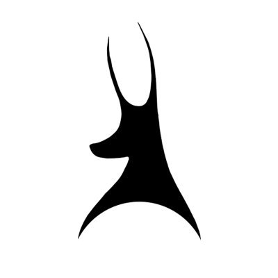
I think it’s obvious that the third kit horse will be our badge soon. Classic marketing - ease it in and let them get used to it.
To be fair - I don’t mind it. |
The standalone horse is horrific as a logo. |  |
| |
| We've had our current badge longer than the yellow one on 22:21 - Oct 19 with 467 views | BtreeBlueBlood |
| We've had our current badge longer than the yellow one on 18:03 - Oct 19 by HighgateBlue |
Having the horse on the 3rd kit is a price I'm willing to pay if it means they don't mess with the proper badge for all other purposes.
But I do take your point. |
And on the corner flags!
Why not our club badge |  | | |
| We've had our current badge longer than the yellow one on 07:01 - Oct 20 with 379 views | Yppswyche |
| We've had our current badge longer than the yellow one on 18:58 - Oct 19 by PhilTWTD |
Current one has always been a bit of a half-arsed, half-finished rebrand of the old one. It's got lines missing where there ought to be lines to remain consistent, a horse that is standing on its two left legs and for some reason lots of red. |
Agreed. If you remove the sentimental eye, it’s real mess of design work. The horse squashed into that box, all the unnecessary red (?), and all those outer shapes, lines & boxes are so clunky, fussy and heavy. It’s like post-modern architecture. Not that I’m advocating for the third shirt solution, however. Simpler is not necessarily better.. Sheff Weds return to their 1960’s badge being a good example of jettisoning the linear. |  | | |
| We've had our current badge longer than the yellow one on 08:19 - Oct 20 with 334 views | VanSaParody |
Current badge is perfect - EXCEPT...
where it's red, it SHOULD BE YELLOW! |  | | |
Login to get fewer ads
| We've had our current badge longer than the yellow one on 09:14 - Oct 20 with 298 views | bringbacktheglory |
What I would be interested in is a vote that can be split according to demographics, particularly age. Of course it won’t be a simple split, but interesting to see if connection to that badge is largely based on identifying with the badge at some point in the lives of supporters. I really like the yellow one, like another poster said, was excited that we used it for the 20/21 season, and can see the appeal but having only known the red one as a supporter, I cannot say that I would rather the yellow. I can get on board with the argument that there’s too much red on the badge, although I do like a touch of red in kits, like this years.
I may be completely wrong. I would be totally against simplifying it to the horse, a marketing fad should not overtake tradition and heart of a club. | | | |
| We've had our current badge longer than the yellow one on 09:39 - Oct 20 with 282 views | mellowblue |
| We've had our current badge longer than the yellow one on 08:19 - Oct 20 by VanSaParody |
Current badge is perfect - EXCEPT...
where it's red, it SHOULD BE YELLOW! |
I don't mind the red, if you remember we went back to the yellow badge in 20/21, but did not warm to it even though it was nostalgic throwback. Maybe because the football was terrible at the time. Re the red badge as some one else said, the horse is scaled up too much within it's space. Looks like it was cobbled together by someone in house rather than a professional. But it is our badge and I would not change it. | | | |
| We've had our current badge longer than the yellow one on 10:04 - Oct 20 with 262 views | VanSaParody |
| We've had our current badge longer than the yellow one on 09:39 - Oct 20 by mellowblue |
I don't mind the red, if you remember we went back to the yellow badge in 20/21, but did not warm to it even though it was nostalgic throwback. Maybe because the football was terrible at the time. Re the red badge as some one else said, the horse is scaled up too much within it's space. Looks like it was cobbled together by someone in house rather than a professional. But it is our badge and I would not change it. |
I think the current horse is better, looks more like the Suffolk Punch it represents anyway
I just think the yellow against blue is a better colour combo than red
Yes, the yellow badge was a 70's & 80's badge which coincided with much of our greatest era, so obviously some historical nostalgia attached, but the current badge which I like best of all, except where it's red, makes it look like Tesco did it - the red NEEDS to revert to yellow! | | | |
| We've had our current badge longer than the yellow one on 10:15 - Oct 20 with 250 views | J2BLUE |
| We've had our current badge longer than the yellow one on 18:58 - Oct 19 by PhilTWTD |
Current one has always been a bit of a half-arsed, half-finished rebrand of the old one. It's got lines missing where there ought to be lines to remain consistent, a horse that is standing on its two left legs and for some reason lots of red. |
I love it.
The more modern fan designed ones are almost always circles and almost always make me think it looks like a Cardiff badge. |  |
| |
| We've had our current badge longer than the yellow one on 10:17 - Oct 20 with 243 views | PhilTWTD |
| We've had our current badge longer than the yellow one on 07:01 - Oct 20 by Yppswyche |
Agreed. If you remove the sentimental eye, it’s real mess of design work. The horse squashed into that box, all the unnecessary red (?), and all those outer shapes, lines & boxes are so clunky, fussy and heavy. It’s like post-modern architecture. Not that I’m advocating for the third shirt solution, however. Simpler is not necessarily better.. Sheff Weds return to their 1960’s badge being a good example of jettisoning the linear. |
Indeed, and the boxes and lines are so inconsistent. Not sure it was actually a professional designer who designed it. |  | | |
| We've had our current badge longer than the yellow one on 10:19 - Oct 20 with 242 views | PhilTWTD |
| We've had our current badge longer than the yellow one on 20:51 - Oct 19 by SitfcB |
I fear had it not been done then than we may have ended up with something worse* further down the line.
*Not worse in my eyes as I like it, no doubt about it. That’s our badge. |
Perhaps. Not sure why there was the need to change from the old one, which I think they should have gone back to at some point over the last 30 years. | | | |
| We've had our current badge longer than the yellow one on 10:27 - Oct 20 with 233 views | SWLondonBlue93 |
| We've had our current badge longer than the yellow one on 18:58 - Oct 19 by PhilTWTD |
Current one has always been a bit of a half-arsed, half-finished rebrand of the old one. It's got lines missing where there ought to be lines to remain consistent, a horse that is standing on its two left legs and for some reason lots of red. |
I like 90% of the badge but would agree that the detailing is poor. It could definitely do with a tidy-up but I would hate to see one of those generic circular badges that have become so common. | | | |
| We've had our current badge longer than the yellow one on 10:36 - Oct 20 with 220 views | HighgateBlue |
| We've had our current badge longer than the yellow one on 18:58 - Oct 19 by PhilTWTD |
Current one has always been a bit of a half-arsed, half-finished rebrand of the old one. It's got lines missing where there ought to be lines to remain consistent, a horse that is standing on its two left legs and for some reason lots of red. |
The way that the horse is standing is really the same as in the former badge. I see it as standing on three legs, with its front right foot on the ball.
I don't know if banishing the gold/yellow was two fingers up at Norwich, but there was plenty of red in the old Borough coat of arms that we used to use as a badge, so I don't see that as a particular problem. Presumably the gold/yellow came from that same source in the first place. Can't see any other reason from it.
I'm happy with the current one. I was happy with the previous one. I just don't see the need to change it. We change our kit(s) every single season. I don't think our badge needs to have ants in its pants too. |  | | |
| We've had our current badge longer than the yellow one on 10:38 - Oct 20 with 215 views | mellowblue |
| We've had our current badge longer than the yellow one on 10:04 - Oct 20 by VanSaParody |
I think the current horse is better, looks more like the Suffolk Punch it represents anyway
I just think the yellow against blue is a better colour combo than red
Yes, the yellow badge was a 70's & 80's badge which coincided with much of our greatest era, so obviously some historical nostalgia attached, but the current badge which I like best of all, except where it's red, makes it look like Tesco did it - the red NEEDS to revert to yellow! |
No, don't equate us to Tesco's, that is a dismal thought. Once we win the Champions League we will change it to gold for all perpituity. | | | |
| We've had our current badge longer than the yellow one on 10:43 - Oct 20 with 200 views | Smoresy |
This was the only badge I knew growing up so it's always felt right, but I wouldn't like it so much if I grew up in the yellow era. Yellow one was great and simpler. | | | |
| We've had our current badge longer than the yellow one on 16:44 - Oct 20 with 108 views | Tractor_Buck |
I'll take my cue on this from National League Solihull Moors, who went from this:
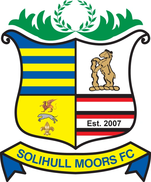
to this:
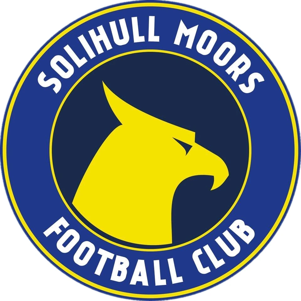
On that basis, I'll stick with what we've got, ta.
I kind of get the Suffolk Punch on the 3rd kit and really rather like it. Over at Telford, this is our club crest:
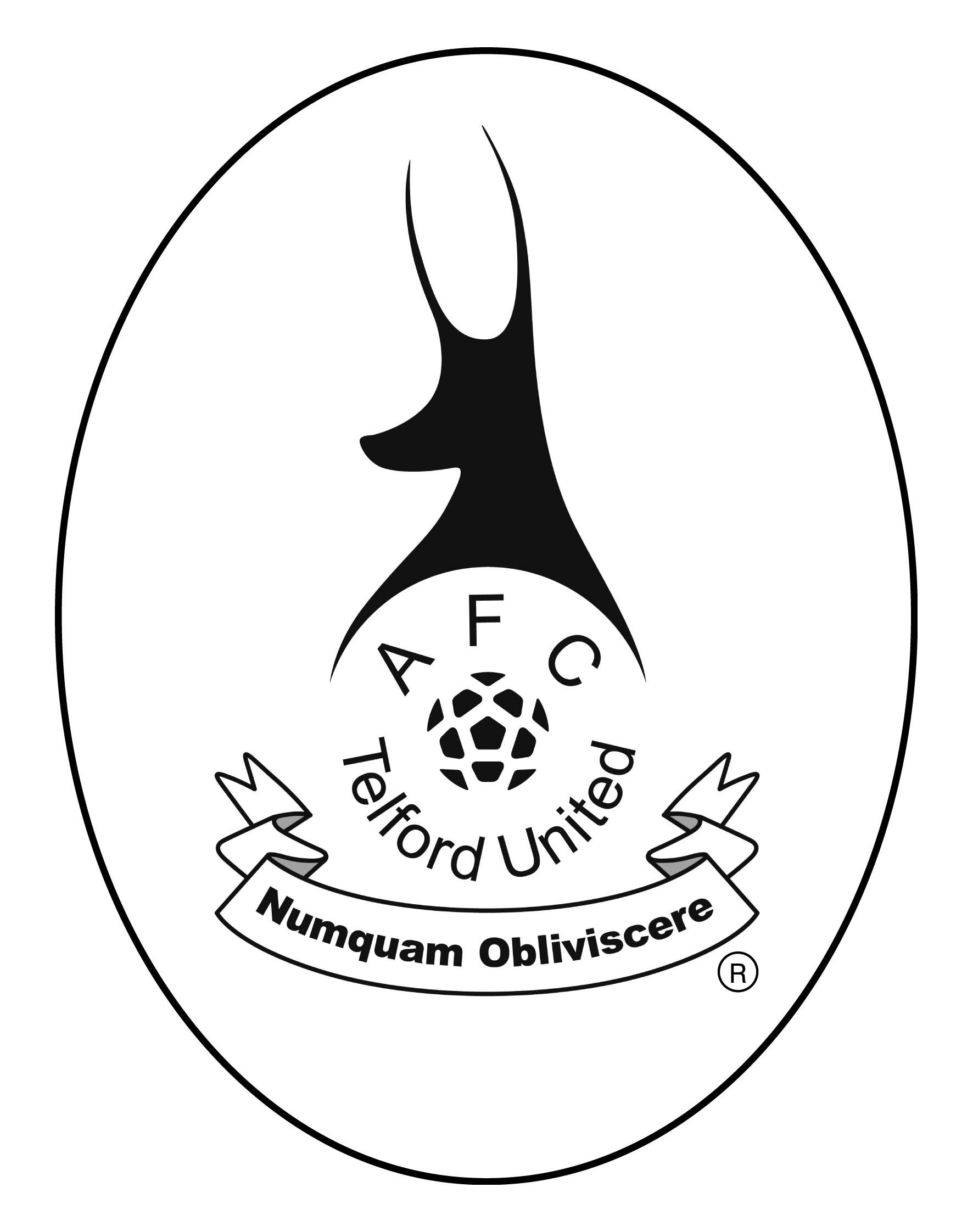
but for social media (and for this season on our shirts) we use this:
purely because it's cleaner in modern formats.
It's already been made clear that the crest will never be retired. |  | | |
| |