| Had a go at redesigning the club badge on 20:58 - May 14 with 1347 views | giant_stow |
| Had a go at redesigning the club badge on 20:55 - May 14 by XYZ |
When are they going to rename stockholm syndrome in your honour? |
How dare you! I can like blue - you lot don't own it you know! All my clothes are blue actually. |  |
|  |
| Had a go at redesigning the club badge on 21:00 - May 14 with 1347 views | giant_stow |
| Had a go at redesigning the club badge on 20:48 - May 14 by Darth_Koont |
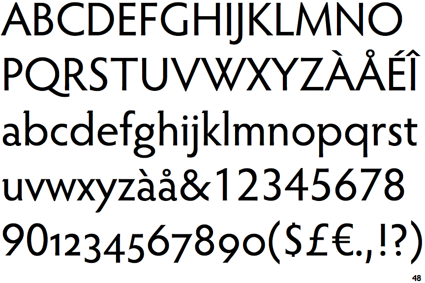
Font-tastic!
Love a bit of fancy font-work. And I really like the “mashed” Ws.
I think it’s a tough job too. The horse, ball and waves are strange elements – and aren’t massively associated with the ITFC brand by anyone other than us who can see the connection back to teams wearing a similar badge in the late 70s and early 80s.
Perhaps like in the 1970s, it’s time to do a complete re-think? Particularly about the elements.
And I’m definitely not saying tractors!! |
I think i might be sad enough to know that font with the w. Deary me. | |
| |
| Had a go at redesigning the club badge on 21:01 - May 14 with 1343 views | Swansea_Blue |
| Had a go at redesigning the club badge on 20:58 - May 14 by giant_stow |
How dare you! I can like blue - you lot don't own it you know! All my clothes are blue actually. |
If all your clothes are blue, does that mean you’re a closet Town fan. |  |
| |
| Had a go at redesigning the club badge on 21:02 - May 14 with 1339 views | giant_stow |
| Had a go at redesigning the club badge on 20:56 - May 14 by jeera |
What you don't want is two colours that just don't go together.
As far as kit/badge designs go, that could be catastrophic. |
I do you hope you're not talking about mother nature's chosen colour combo of green and yellow? | |
| |
| Had a go at redesigning the club badge on 21:03 - May 14 with 1335 views | giant_stow |
| Had a go at redesigning the club badge on 21:01 - May 14 by Swansea_Blue |
If all your clothes are blue, does that mean you’re a closet Town fan. |
No! | |
| |
| Had a go at redesigning the club badge on 21:08 - May 14 with 1320 views | Darth_Koont |
| Had a go at redesigning the club badge on 21:00 - May 14 by giant_stow |
I think i might be sad enough to know that font with the w. Deary me. |
It’s a Rennie Mackintosh isn’t it? Gave me distinct Scottish vibes anyway. |  |
| |
| Had a go at redesigning the club badge on 21:22 - May 14 with 1290 views | hoppy |
Haha... that was brilliant. I could never decide which looked worse... the yellow and green or the green and yellow one... and as for that hideous yellow and green one as well...
Oh, and I often appreciate your jokes... but that’s not saying much coming from me, is it? [Post edited 14 May 2021 21:23]
|  |
| |
Login to get fewer ads
| Had a go at redesigning the club badge on 21:25 - May 14 with 1285 views | giant_stow |
I'm very slow, don't mind me. | |
| |
| Had a go at redesigning the club badge on 21:27 - May 14 with 1283 views | giant_stow |
| Had a go at redesigning the club badge on 21:08 - May 14 by Darth_Koont |
It’s a Rennie Mackintosh isn’t it? Gave me distinct Scottish vibes anyway. |
You're right (and I looked up the font I had in mind, but nothing like it) | |
| |
| Had a go at redesigning the club badge on 21:46 - May 14 with 1274 views | Vic |
I like the way the horse seems to be doing some sort of stepover. |  |
| |
| Had a go at redesigning the club badge on 21:48 - May 14 with 1271 views | XYZ |
| Had a go at redesigning the club badge on 20:58 - May 14 by giant_stow |
How dare you! I can like blue - you lot don't own it you know! All my clothes are blue actually. |
You admired our horse. |  | | |
| Had a go at redesigning the club badge on 21:52 - May 14 with 1265 views | PhilTWTD |
| Had a go at redesigning the club badge on 20:18 - May 14 by bugblatter |
I loved that old Bluey. I really do often wonder what happened to him. He must be somewhere. They wouldn’t have skipped him surely?!
AN INVESTIGATION MUST BE ARRANGED.
Shall I start a crowd-funder? |
I did an investigative piece some years ago. The headline was Old Bluey Turned to Gluey which may give a few clues about his fate. |  | | |
| Had a go at redesigning the club badge on 22:00 - May 14 with 1246 views | Darth_Koont |
| Had a go at redesigning the club badge on 21:52 - May 14 by PhilTWTD |
I did an investigative piece some years ago. The headline was Old Bluey Turned to Gluey which may give a few clues about his fate. |
Very nice work. [Post edited 14 May 2021 22:02]
| |
| |
| Had a go at redesigning the club badge on 22:10 - May 14 with 1236 views | BryanPlug |
[content removed at owner's request] |  |
| |
| Had a go at redesigning the club badge on 22:39 - May 14 with 1224 views | Kropotkin123 |
It's good start, and looks like you had fun.
I think you've broken some of your own design rules/observations. You talk about the Forest badge and others as inspiration for dropping part of the name or dropping the names in their entirety. This gives those a decluttered feel. But then you add FC and the founding date in there and it clutters it back up again.
The referenced new badges have taken out colours, stripping them back to 1-3 colours. But you've gone from 3 to 4 colours. Again, it makes it feel cluttered and too much.
I like the changes to the horse, but think it could be refined.
Overall, I think your analysis has been spot on, but the end-product needs to conform to that. [Post edited 14 May 2021 22:40]
|  |
| Submit your 1-24 league prediction here -https://www.twtd.co.uk/forum/514096/page:1 - for the opportunity to get a free Ipswich top. | | Poll: | Would you rather | | Blog: | Round Four: Eagle |
| |
| Had a go at redesigning the club badge on 22:39 - May 14 with 1226 views | ghostofescobar |
I like them. Good work. |  |
| |
| Had a go at redesigning the club badge on 22:40 - May 14 with 1223 views | bugblatter |
| Had a go at redesigning the club badge on 21:08 - May 14 by Darth_Koont |
It’s a Rennie Mackintosh isn’t it? Gave me distinct Scottish vibes anyway. |
It’s actually just Gill Sans (the same as the current logo, just not in bold). I made the W by crashing together two Vs… |  | | |
| Had a go at redesigning the club badge on 23:47 - May 14 with 1193 views | DropCliffsNotBombs |
| Had a go at redesigning the club badge on 21:46 - May 14 by Vic |
I like the way the horse seems to be doing some sort of stepover. |
In a nice nod to Gwion, the horse has mis-controlled the ball. |  | | |
| Had a go at redesigning the club badge on 00:04 - May 15 with 1191 views | hoppy |
Interesting blog - I enjoyed reading that.
With your final one, I would prefer not to have the split blue myself. I like the blue of the streamlined ones you'd got without the shield, so I think that would work better overall - I like what you've done in getting rid of so many keylines too - looks much cleaner and better like that. Nice work.
If it was changing, I'd like to go with your more streamlined approach, but retain the shield - something like this, with the same blue overall, and then rather than having a second blue, the Suffolk Punch just using grey against the blue...
 | |
| |
| Had a go at redesigning the club badge on 00:30 - May 15 with 1181 views | Kropotkin123 |
| Had a go at redesigning the club badge on 00:04 - May 15 by hoppy |
Interesting blog - I enjoyed reading that.
With your final one, I would prefer not to have the split blue myself. I like the blue of the streamlined ones you'd got without the shield, so I think that would work better overall - I like what you've done in getting rid of so many keylines too - looks much cleaner and better like that. Nice work.
If it was changing, I'd like to go with your more streamlined approach, but retain the shield - something like this, with the same blue overall, and then rather than having a second blue, the Suffolk Punch just using grey against the blue...
|
That looks cleaner. Much better than the current badge. Still not sure we need the FC and founding date though. | |
| Submit your 1-24 league prediction here -https://www.twtd.co.uk/forum/514096/page:1 - for the opportunity to get a free Ipswich top. | | Poll: | Would you rather | | Blog: | Round Four: Eagle |
| |
| Had a go at redesigning the club badge on 00:38 - May 15 with 1176 views | hoppy |
| Had a go at redesigning the club badge on 22:40 - May 14 by bugblatter |
It’s actually just Gill Sans (the same as the current logo, just not in bold). I made the W by crashing together two Vs… |
It's got a bit of Hypatia Sans Pro about it as well...
https://www.fontspring.com/fonts/adobe/hypatia-sans-pro
 | |
| |
| Had a go at redesigning the club badge on 09:14 - May 15 with 1072 views | Charlie_pl_baxter |
I'd love to see the version you tried with a gold /yellow background. |  |
| |
| Had a go at redesigning the club badge on 09:27 - May 15 with 1064 views | ElephantintheRoom |
Interesting and thoughtful effort. Logos are always contentious - and the simpler the better often seems the best option.
I see someone has already shared my own view - that the red is an unwarranted extra. I also think you overegged it with the fetlocks - make the horse looks like it is wearing 1920's football boots.
On a slightly more cynical note the club is now an offshore investment - so a background of £ and$ signs, or the horse tilted and drowning in a river of debt might more be appropriate to the modern club
Interesting artcile though - thanks for sharing | |
| |
| |