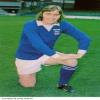
| Kit 10:03 - Jul 6 with 13293 views | hoppy |
|  |
| |  |
| Kit on 10:26 - Jul 6 with 2178 views | Westover |
Much prefer last seasons. |  | | |
| Immediate thoughts…. on 10:30 - Jul 6 with 2142 views | Buhrer |
| Immediate thoughts…. on 10:08 - Jul 6 by Bloots |
….its a “no” from me.
The home kit is too “stripey”, they aren’t really pinstripes.
The badge looks stupid with the white shield round it, unnecessary really.
The Umbro badge is pointlessly fussy.
Overall it looks like an old Brighton shirt.
The away kit just looks like a Burnley kit.
Home - 5/10
Away - 6/10 |
Mrs B here was poised to order shirts for the family... "who wants one? Let's be having you?" was her family WhatsApp......
Saved myself a couple of hundred quid today. |  | | |
| Kit on 10:32 - Jul 6 with 2127 views | Metal_Hacker |
Away kit is beautiful |  |
| |
| Kit on 10:32 - Jul 6 with 2128 views | GeoffSentence |
I like them both. I like them a lot. Quite a bit rests upon the shorts for the home kit, they must be white. |  |
| |
| Kit on 10:33 - Jul 6 with 2111 views | TrumptonBlue |
There's something I've wondered over the last couple of seasons - why is the sponsor logo smaller (proportionally) on the women's shirts? |  | | |
| Kit on 10:33 - Jul 6 with 2107 views | Whos_blue |
I don't mind either shirt.
As others have said, the collars and sleeve tips aren't great. Unlike others, I like the pin stripes.
Not sure about the red Umbro bit.
Not the best. Not the worst.
I like the away shirt.
The kit reveals are always a big noise, but for me they are just a stepping stone to what is really important.
Seeing the Town gracing the pitch at the start of a new season.
Of course this year "We are Premier Leeeeeague!"! |  |
| "Look, I don't wanna be the same as everybody else. That's why I'm a Mod, see?" |
| |
| Kit on 10:36 - Jul 6 with 2061 views | DarkBrandon |
I think they both look fantastic.
My favourites for decades. Shame I’m too old to wear them really. |  | | |
Login to get fewer ads
| Kit on 10:37 - Jul 6 with 2058 views | TrumptonBlue |
The navy trim on the shorts and socks does tie the whole thing together a bit better, I think. | | | |
| Kit on 10:38 - Jul 6 with 2041 views | Hugoagogo_Reborn |
| Kit on 10:33 - Jul 6 by TrumptonBlue |
There's something I've wondered over the last couple of seasons - why is the sponsor logo smaller (proportionally) on the women's shirts? |
My guess, as a woman, is that it's easier to read the sponsor logo if smaller, as boobs distort the shape of the shirt more than moobs do.
Or, it gives men an excuse when they stare at boobs to say "sorry, I was just trying to read the small sponsorship logo on your lovely football shirt...." [Post edited 6 Jul 2024 10:44]
|  |
| |
| Kit on 10:44 - Jul 6 with 1995 views | Yppswyche |
That fussy shield again! Why?? | 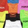 | | |
| Kit on 10:46 - Jul 6 with 1979 views | bluearmy4838 |
Really like the away, it’s a lovely colour.
Home is a bit meh. Hate the flash of red in the Umbro logo, completely unnecessary. |  | | |
| Kit on 10:48 - Jul 6 with 1954 views | stonojnr |
| Kit on 10:36 - Jul 6 by DarkBrandon |
I think they both look fantastic.
My favourites for decades. Shame I’m too old to wear them really. |
you are never too old. | | | |
| Kit on 10:52 - Jul 6 with 1920 views | stonojnr |
| Kit on 10:46 - Jul 6 by bluearmy4838 |
Really like the away, it’s a lovely colour.
Home is a bit meh. Hate the flash of red in the Umbro logo, completely unnecessary. |
but we dont get a choice with the Umbro logo, I dont get why people keep bringing that up ?
thats the Umbro logo to celebrate their centenary. a detail also brought out on the away kit, West Hams is only white on their new home kit because the red part wouldnt stand out as much. | | | |
| Kit on 10:59 - Jul 6 with 1860 views | TrumptonBlue |
| Kit on 10:52 - Jul 6 by stonojnr |
but we dont get a choice with the Umbro logo, I dont get why people keep bringing that up ?
thats the Umbro logo to celebrate their centenary. a detail also brought out on the away kit, West Hams is only white on their new home kit because the red part wouldnt stand out as much. |
On all the other new Umbro kits I have seen, those that have the filled in central diamond have it in a colour designed to tie in with the kit. I think that's what they have tried to do with us, using red to echo the badge, but it doesn't work imo. White would have been better. [Post edited 6 Jul 2024 11:00]
| | | |
| Kit on 10:59 - Jul 6 with 1857 views | Bluebell |
I don’t like the necklines. Much prefer a collar.
I love the away shirt. |  | | |
| Kit on 11:00 - Jul 6 with 1851 views | burnbudgiesburn |
Love them both, a lot. Best shirts for a few years.
My only slight nitpick on the home is the shield around the badge.. meh | | | |
| Kit on 11:00 - Jul 6 with 1852 views | Ryorry |
I've always liked pinstripes & hugely prefer unfussy V necks to other silly frilly necks, so really like the home shirt - *apart from* the stupid white line round the badge & the distracting red of the manufacturer's name. 8/10
Away - not sure yet, will need to see it worn on the pitch in a match to make up my mind I think - am not generally a fan of maroon, esp when it's a fussy mix with something else; and that round collar looks quite high, I wonder how the players will find it for comfort? |  |
| |
| Kit on 11:03 - Jul 6 with 1825 views | Lord_Lucan |
| Kit on 10:48 - Jul 6 by stonojnr |
you are never too old. |
14 is the age limit for a football shirt unless you are on holiday.
Them's the rules. |  |
| |
| Kit on 11:08 - Jul 6 with 1777 views | Bluebell |
| Kit on 11:03 - Jul 6 by Lord_Lucan |
14 is the age limit for a football shirt unless you are on holiday.
Them's the rules. |
Mr BB had an Ipswich t- shirt on in Majorca a couple of weeks back.
It’s surprising how many people came up to him and commented about how well Ipswich are doing now! | | | |
| Kit on 11:10 - Jul 6 with 1767 views | Cafe_Newman |
Both good though I have my doubts about the line around the badge on the home shirt. I'm sure both will continue to grow on me. [Post edited 6 Jul 2024 11:13]
|  |
| FREE PALASTINE FROM ZIONIST BOMBS. FREE LEBANON FROM ZIONIST BOMBS. FREE IRAN FROM ZIONIST BOMBS. |
| |
| Kit on 11:10 - Jul 6 with 1767 views | Dubtractor |
I quite like them both. The shield round the badge clearly a nod to our kits from 92/93. |  |
| |
| Kit on 11:11 - Jul 6 with 1767 views | Reus30 |
Bought the home and one for my doggo too.
The bigger story is I showed my wife the pictures of the away kits and she started dribbling over Harry Clarke... |  | | |
| Kit on 11:13 - Jul 6 with 1736 views | bluearmy4838 |
| Kit on 10:59 - Jul 6 by TrumptonBlue |
On all the other new Umbro kits I have seen, those that have the filled in central diamond have it in a colour designed to tie in with the kit. I think that's what they have tried to do with us, using red to echo the badge, but it doesn't work imo. White would have been better. [Post edited 6 Jul 2024 11:00]
|
Yeah or blue. The red looks terrible. | | | |
| |